Basic Design Principles in Desktop Publishing
In order to streamline the process of information delivery, as well as boost visual communication, interested parties apply different formats of marketing projects. Thanks to leveled-up graphics and compliance with desktop publishing principles of design and layout, it won’t be a problem to produce online and offline documents without compromising their quality and efficiency.
The challenge is clear, so it is high time to get up in arms and find out nuances that distinguish standard publishing from its advanced alternative.
Balance
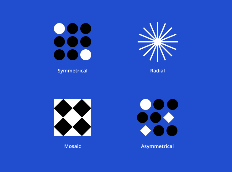
Your projects have to remain cohesive, complete and satisfactory even if they are multicomponent. The weight of every design element has to be harmonized with other component parts. The following types of balance will work for photography, design and art:
- symmetrical
- asymmetrical
- radial
- mosaic (or crystallographic)
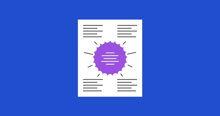
Proximity/Unity
This principle is about the visual hierarchy of your project. Even if you have a lot of information blocks, placing them correctly on the layout will help you avoid clutter. Instead of overly separating them, try creating grouped patterns. This strategy will work best if such items are related to one other.
Following this information organization, whatever format it is enables viewers to find what they are searching for faster and simpler. Basically, this concept implies connecting related things together and locating divergent ones separately—that is how your contextual and visual logical system can be created.
In turn, unity is a guiding aspect for designers, becoming one of the most crucial principles of design in desktop publishing. By creating a relationship between a layout’s elements, it is critical to leverage the composition in general. Unlike proximity, unity is frequently achieved by implementing third-party bridges in order to connect non-related details.
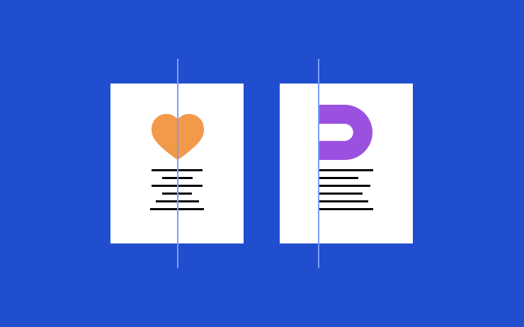
Alignment
Simply put, this term defines how designers arrange different elements in relation to the layout’s edges or borders of one of its particular parts:
- With edge alignment, design elements can follow these principles — to the top, bottom, right or left.
- In the case of center alignment, the balance is adjusted either horizontally or vertically.
- For a less strict impression, creators prefer mixed alignments. The grid basement is preserved, but the style is more dynamic and radical.
Alignment is a powerful ally of balance in design. You can also create a logical structure (it doesn’t have to be plain) and visual connections, which results in a harmonious organization of the template. The application of alignment can be diverse, but the key thing is that it offers a professional and crisp finish for your projects.
Repetition/Consistency
One of the ways to create a harmonious and attention-grabbing design is to actually reuse some similar patterns within the project. Here are some things to know about this principle:
- The repetitive application of the same or analogous elements can be random or structured. In the latter case, these patterns can be aligned evenly or unevenly.
- Using symmetry will bring more unity to the project, increasing its cohesiveness and consistency.
- Conversely, playing with repetition adds a brighter visual texture to layouts.
Consistency, a partner of repetition, is capable of unifying divergent details. You will succeed if you take into account human cognition and ensure your visuals contribute to the quality of your viewers’ experience.

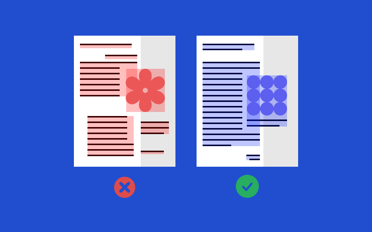
Contrast
Black and white is a perfect example of contrasting colors, but this principle is deeper than that. In graphic design, such patterns are implemented to draw customers’ attention more effectively. The slightest change in shadowing and highlighting is capable of drawing the eye movement as expected. It is high time to rethink what is meant by contrast:
- Don’t focus on color palettes. They are undoubtedly crucial, but generating impact through contrasting textures, scales, alignments, text fonts, image patterns, etc., is also a part of this design strategy.
- You should always bear in mind your context. Contrast isn’t intended to be random or inappropriate. It is a good way to fight against meaningless designs and complement the visual architecture of the layout, showing what is better to “grab” at first.
White Space
This is probably one of the most underestimated principles among numerous experts in the field. The fear of missing an important message always exists, so filling projects with multiple data blocks often occurs. However, they require their comfort zone as well. Also famous as negative space, the last but not least vital principle stands for functionalizing emptiness around several content elements:
- It helps to improve readability and complements layout scalability and alignment.
- Designs that aren’t overcrowded seem more elegant and cleaner.
- This method is ideal for emphasizing certain structural patterns/elements.