Working with Your Desktop Publishing Document Text
Billboards, accounts on Instagram, menus in restaurants, online advertisements, invitations and business cards—it might seem challenging to guess why these disparate notions are listed together here. Usually, people don’t think about how interconnected different phenomena really are. In this case, text content is what allows several types of presenting information to be so unique and attention-grabbing.
To be more exact, letters on their own are just basic blocks for an enthusiast to deliver a message to a particular recipient. However, for those who desire to spread their services or products through divergent channels, it is essential to ensure the text style chosen is correct.
It is hard to argue that content without a certain structure would look simply ugly and non-professional—the level of readability and understanding of the hidden essence of the message would be dramatically reduced.
That’s why we have to discover and master different methods of manipulating text files. Although some of them may seem simple, a lot of experts easily forget about these tips and pieces of advice, focusing more on visual content like images.
Document Layers
It doesn’t matter whether you plan to share your flyers, brochures or other types of files via the internet or create their printed versions—you have to consider which document format will work best. One of the safest and most versatile solutions is PDF. It is accessible from different platforms and is beneficial in terms of size requirements.
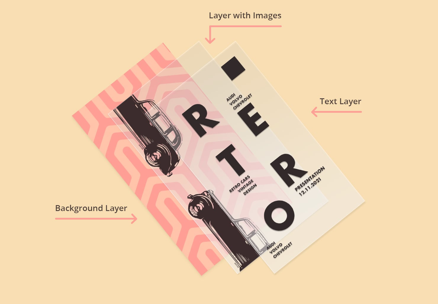
What you should know about PDF files is that they contain different layers. Each of them can possess unique features and be rearranged in a necessary way. Designers are able to alter the order of content, making text appear as a background or vice versa. With the help of settings, customers can provide access to the layers’ display or even hide a certain layer, while ensuring its printability.
This functionality will come in handy, for example, when you have to send the file to different departments—it will be another way of sharing notes and important details about the project. For instance, an inquiry to rewrap the text may confuse responsible parties who work only with image content.
Text Tools for Your Mac
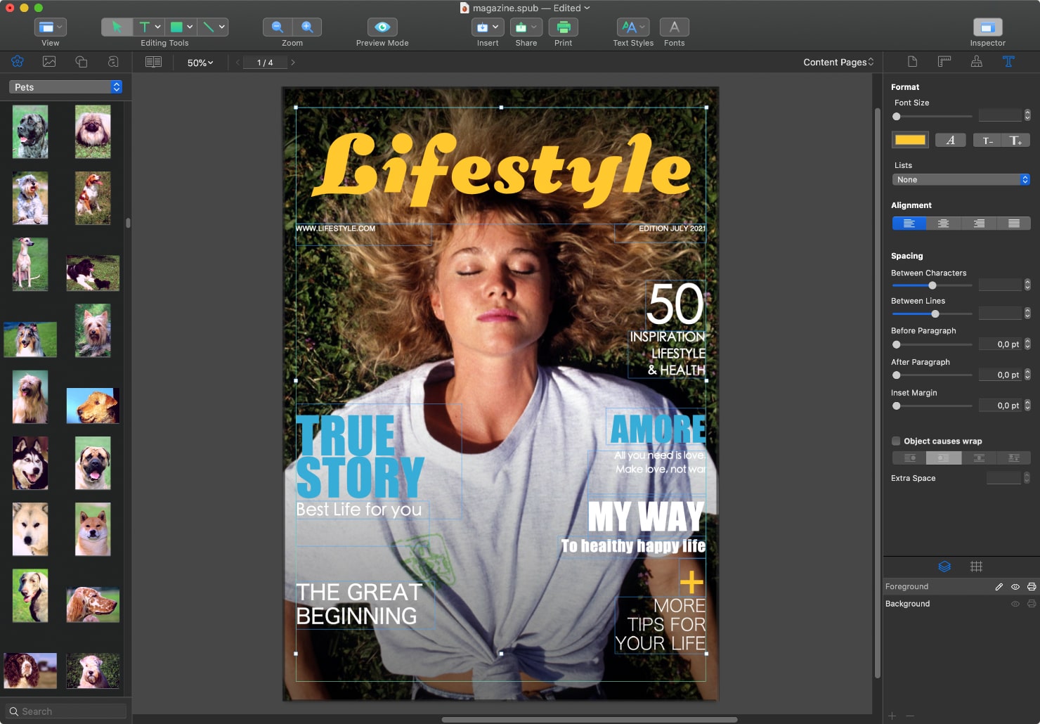
When formatting the text on a Mac, users edit the content by placing the objects, using proper text wrapping and choosing the appropriate fonts, lists, alignment and spacing characteristics. For entering text information within the software on an image layout on the Mac, text boxes are commonly used.
What is a text box? In plain English, it is a control bar for text processing. They can be editable and non-editable. The latter will function as a nice element of design for depicting required information.
Text entry boxes will also solve the problem of text rotation. They will enable enthusiasts to work with vertical and circular text features on a Mac. You are welcome to experiment, creating divergent samples for your canvas. Then you will see which format of the text looks better.
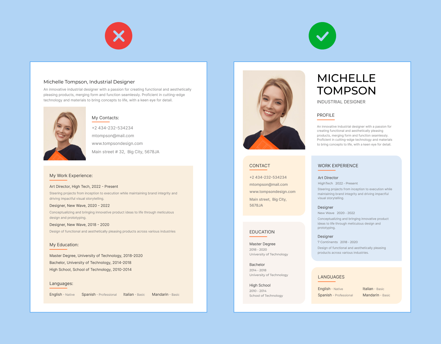
Organizing Your Document Text
To better understand and process information, text in a document should be organized into a framework.
Writers use things like titles, headings and subheadings, and divide the body text into paragraphs. All these are subtle cues to the reader that the text is presenting the major idea, introducing a new idea, and presenting supporting points. These things come across visually, simply by the way a text is organized.
Choosing What’s Important
First and foremost, the title is the topic of a text, so it should immediately let the reader know what your document is about. A title doesn’t need to explain everything, but it sets out what the reader can expect to learn. One way to choose a title is to ask yourself, “If there is one thing I intend to say to the reader about my document, what is it?”
Next, consider the main points that the document conveys. Choose the most important ideas that help explain the topic in more detail. If you’ve written an outline before you’ve written your full document, the outline points will help you choose subheadings for the text.
If you don’t have an outline, you can simply write down the critical points you’d like the reader to know from reading your article. Think about the “big ideas” of the document, rather than the points of detail. Those “big ideas” will form the headings.
Under each heading, you may or may not have subheadings, depending on your document’s length. These are points that give details about the headings. Subheadings are a good way to break up lengthy text into ideas that are more easily digestible.
If the written piece is a story or a non-fiction report in chronological order, the headings will simply be the main events that took place. And the subheadings can be the smaller, less important events that happened.
Not every document has to have subheadings. It depends on how complex the text is, and how much information you have to convey. Overall, headings and subheadings are helpful for the reader, to quickly let them know what the coming paragraphs are about.
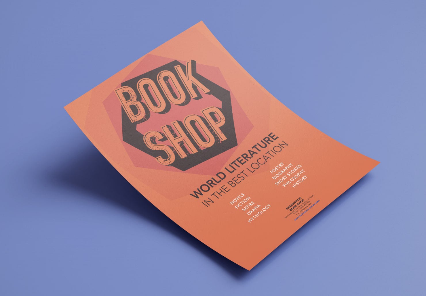
Colors and Styles
Once a document has a structure, it’s time to pay attention to other details that can make your document more visually attractive. Changing the text color and varying the style of the text are two ways to do this.
The text color is the most important element because it impacts readability. It’s key to make sure the text color provides enough contrast with the background that it’s easy to read. If you want to use different colored text, make sure the contrast is still high enough that the eye doesn’t have to strain to see it.
If you do decide to try different colors of text, it’s best to use no more than 3 colors in a document, to keep it cohesive. You might use one different color for the headings and one color for subheadings.
Another way to draw the eye to a certain portion of text is to make it a different color than the rest. For example, if your text is all black, and you have a sentence or quote of particular importance, try varying the color to make it stand out from the rest of the text.
Aside from colors, visual interest also comes through the styles of your text. Using bold to emphasize the title will make it stand out. Even subheadings in bold are a great way to divide up a text and help the reader instantly understand that what they’re reading is a key point. Bold subheadings also help a reader find what they are looking for more quickly.
Italics are a great way to place importance on short phrases you’d like to emphasize, or meaningful words or quotes in the document. And another style choice is underlining. Though it should be used very sparingly, underlining can be used for a title to make it stand out. Underlining should not be used throughout a text, because a reader will automatically think it is a hyperlink, since links are usually formatted as underlined online.
Whatever style you choose for headings and subheadings, make sure you remain consistent throughout the document. This helps the reader mentally organize as they read, so be sure the headings are alike in style and size, and subheadings are alike in style and size as well.
Layout Techniques for Better Organization
Layout is the way text, headings, images and other elements are arranged within a document. While headings and subheadings are the main way to organize ideas and structure content for meaning, layout is the way to structure the document for visual appeal.
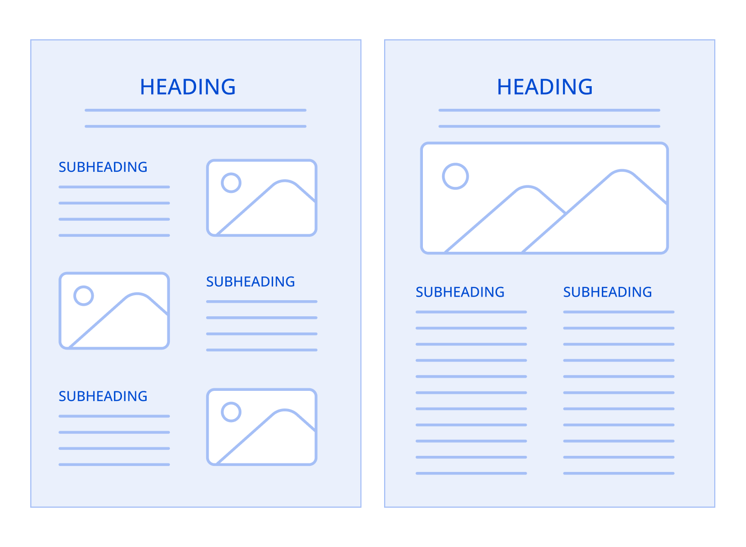
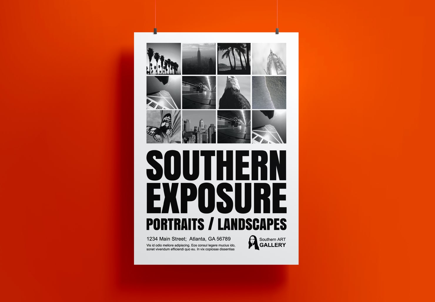
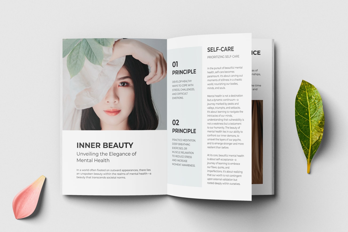
Using columns and text boxes, also known as text frames, can greatly enhance the readability of a document. Columns break up text into easily readable pieces, and are particularly useful in magazines or newspapers. Text boxes, or placing text within an outlined box, are a great way to include important side notes, or something that should stand out from the rest of the document. They can draw a reader’s eye to a key idea, but without taking attention away from the main text.
Another layout technique is to make use of lists and bullet points. Lists are a helpful way to organize key points or steps in a process. They make it easy for a reader to quickly get a summary of the most emphasized points about an idea. Bullet points next to key ideas also help a reader quickly scan a document and take in important points.
Used thoughtfully, columns, text boxes, lists and bullet points are perfect ways to create a more structured and reader-friendly document.
Balancing Your Page
When you have fully laid out your text, and made style choices throughout, then you’ll want to consider the overall balance of the page. Balance in a document represents making sure the text, white space and any images or illustrations are visually equal.
For example, if there are several paragraphs of text together in one portion, then another document portion has more white space, you will want to redistribute the text so the paragraphs are more even.
If you have used lists or text boxes, make sure they are also distributed throughout the document, so there is a balance. One way to check the balance of a page is to hold the page at arm's length, or stand a few feet back from the screen if you’re designing digitally. Notice where your eye immediately goes. Is there an area that seems blank? Is text and white space even throughout? If not, consider whether you should change the size or spacing of the headings or subheadings. If a document is text heavy, using columns can also help balance a lot of words on a page.
Balance is just one more element that helps make a document visually appealing and easier to understand.
Making Your Text Easy to Read
Fonts
You may have written the most engaging story or article in the world, but if you choose a font that isn’t readable, or if the spacing is off, the document will be difficult to read. To make your document text easy to read, the most important point is to choose a readable font.
Select clean and easy to read fonts, and keep them consistent throughout. Consider using a different font for the headings than for the paragraph text. This helps a reader know the hierarchy in the document, and understand what the most important points are.
Spacing
Line spacing is another way to add readability to a document. If text is too close together, the lines can appear cramped, and it will be harder for your reader to distinguish between lines. It is easier for the eye to process information if there is space between lines, enough that it’s easy to focus on one line of text at a time.
Margins
Aside from line spacing, margins also impact how readable and neat the document looks overall. A margin that is too wide will create too much white space on either side of the text, while one that is too narrow can make the page look crowded. A standard page margin is one inch on all sides, but this can be varied slightly depending on the overall balance of the page.
Images and Graphics
Additionally, using images and graphics can give visual variety and aid the reader’s comprehension, especially for complex subjects. Images and graphics should always complement the text, and break up large blocks of text. Images explain an idea, and give rest points for the reader’s eyes. Altogether, these design choices create a visually beautiful and reader-friendly document.
A Well-Organized Document
Organizing your document text is highly important for visual appeal and for a reader’s understanding and ease. It is easy to organize any document, as long as you keep a few key points in mind. Structure your content with clear headings and subheadings, so it is evident what the most important ideas are, and what the supporting points are. Consider varying colors and styles of text, to give appeal and draw attention to main ideas.
The layout is just as important as the content, so make use of columns and text boxes if needed, to help with clarity. Overall, strive for balance between text and white space in the document. Choose a readable font, and make sure the lines are spaced out so a reader can focus on one line at a time. The margins also add to the overall balance on the page. And lastly, incorporate images and graphics into a document to add interest and help a reader understand information.
By thoughtfully combining all these visual elements in your document, your written communication will be more clear, professional and easily understood by a reader.