Fonts in Desktop Publishing
Fonts are one of the most important elements of desktop publishing, they are more than simply letter designs; they are the design graphics that convey a message through the typeface.
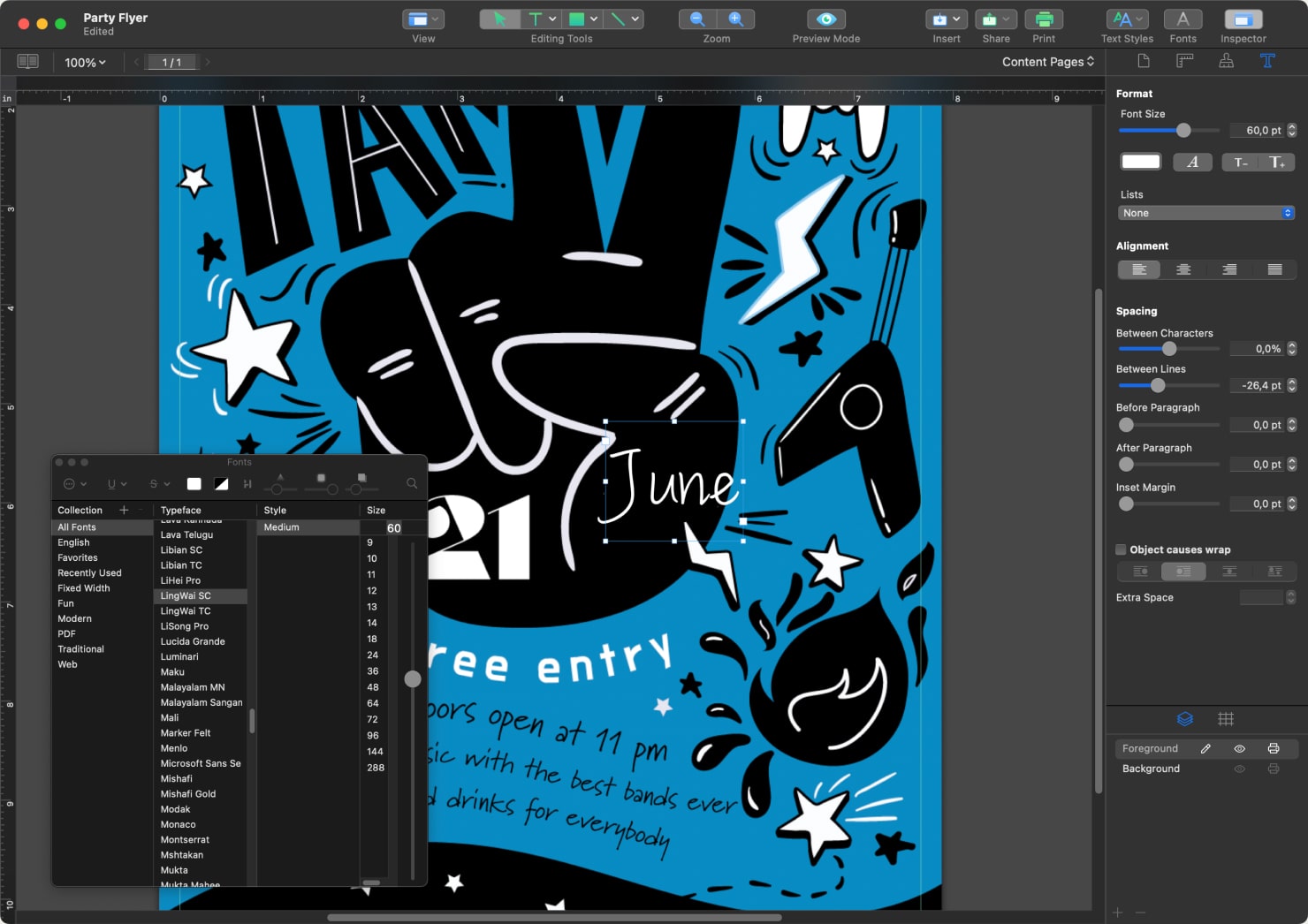
Font sizes help set the tone for a document, and let readers understand the visual hierarchy of an overall piece. Larger fonts let the reader know to pay attention and that something important will follow. Smaller fonts sizes combined with larger fonts give the idea that there are more details for a reader to know.
There is a lot that goes into a font design for typefaces, and there is a reason why. The size, weight and spacing of letters all become part of the message. The way different fonts are paired also can create contrast and impact.
Overall, fonts take a foundational design place in DTP. Knowing how to choose the right fonts for a document, and how to strategically use them is the key to making your desktop publishing pieces professional and polished.
The Definition and Purpose of Fonts in Design
A font is all the visual elements applied to a typeface, such as the weight, size and spacing of letters. Fonts give typefaces–the unique letters, numbers and characters used in type–their distinctive style. Most importantly, fonts should enhance the readability of a document. But more than that, fonts also play a big part in the overall visual appeal of a document for a reader.
Another important purpose of a font is to set the mood for the information being conveyed. Is the written text serious and somber? Is it playful and humorous? Or perhaps, the text is succinct and crisp, conveying only the necessary information.
Designers will choose a different font for each type of message. For every document, there is a perfect font that helps create a complete visual experience and best communicates the message to the reader.
Different Font Categories
In the world of fonts, there are 4 main classifications that apply to their styles:
- Serif
- Sans-serif
- Script
- Decorative
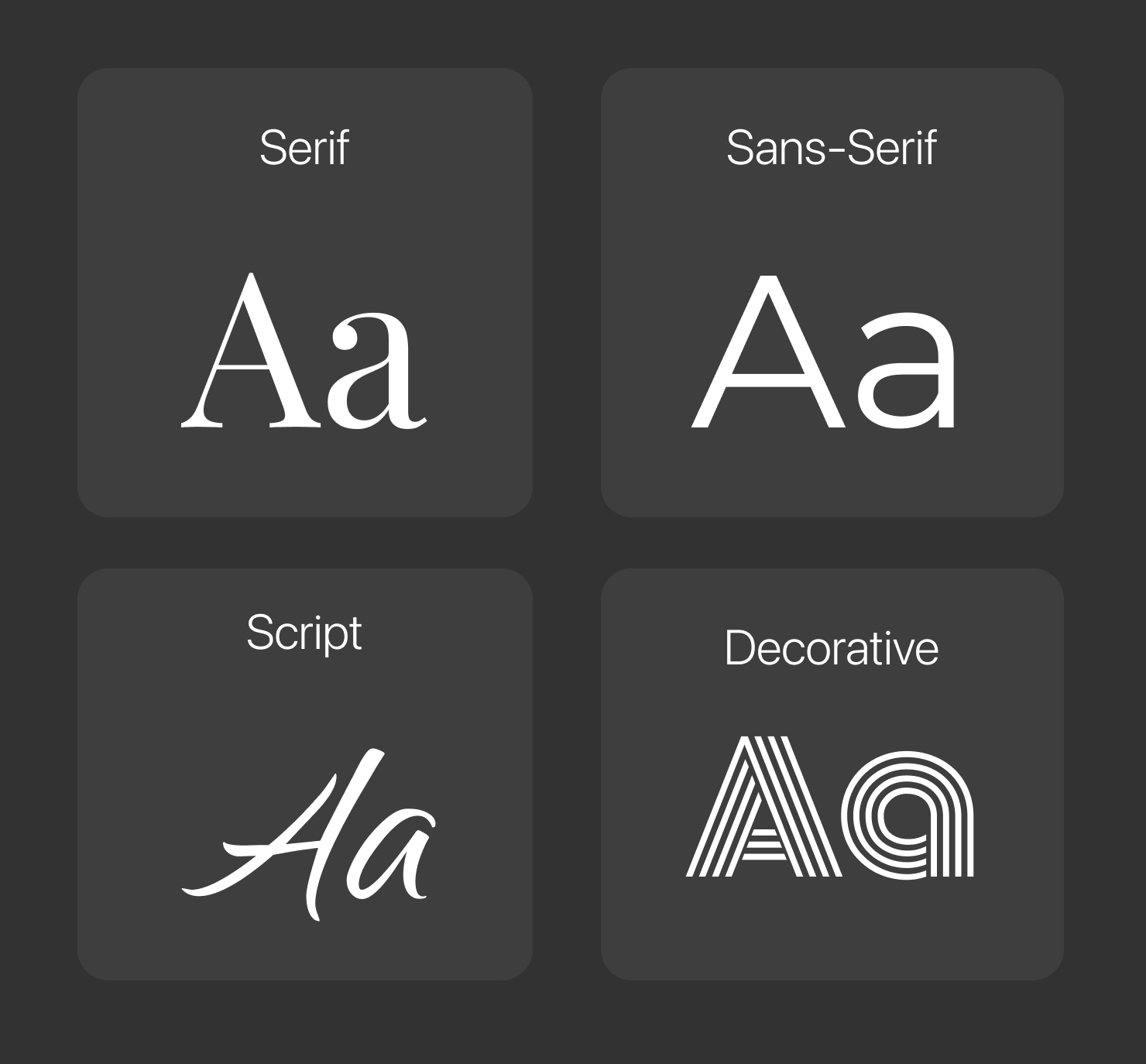
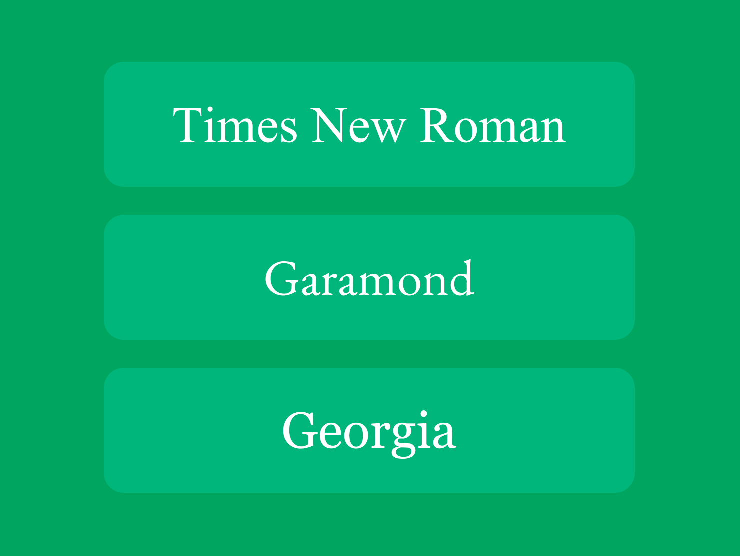
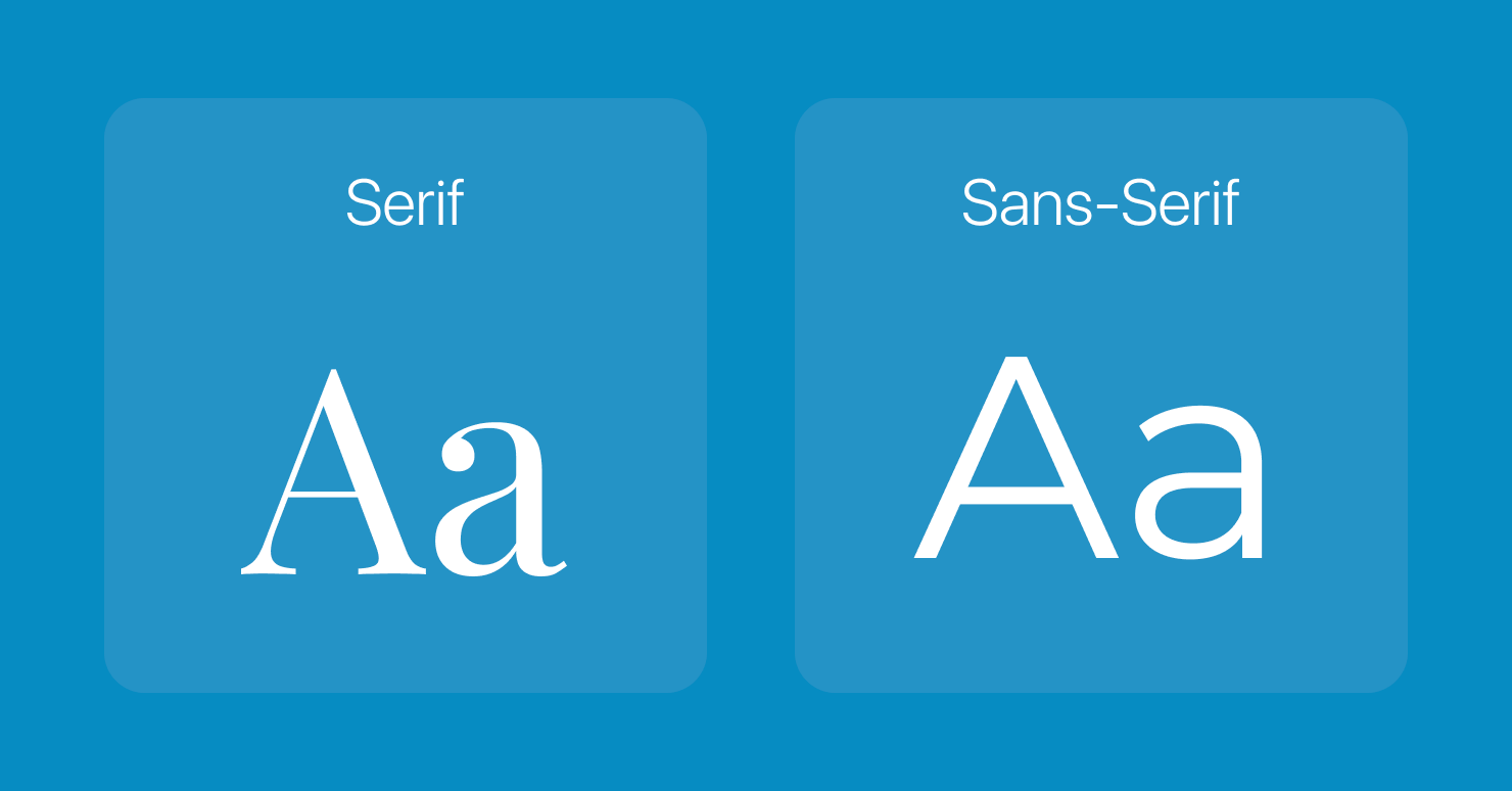
Serif fonts are characterized by the small lines, called serifs, at the ends of each line of a letter. This style is formal and traditional. Examples of serif fonts are Times New Roman, Garamond and Georgia.
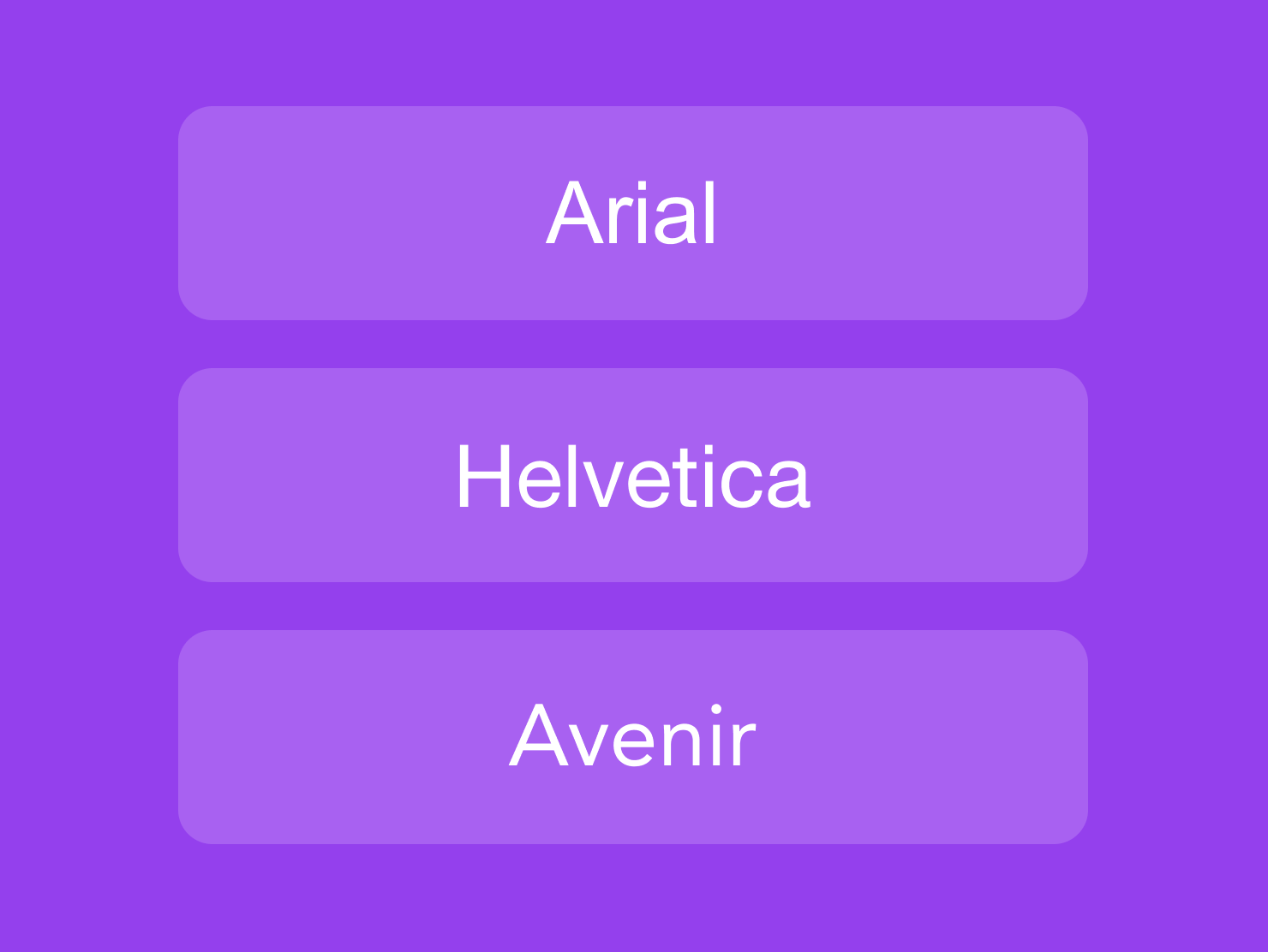
Sans-serif fonts are known by the absence of the “serifs”, or small lines, on each letter. This style is clean and simple, and conveys a modern feel. Popular sans-serif fonts are Arial, Helvetica and Avenir.
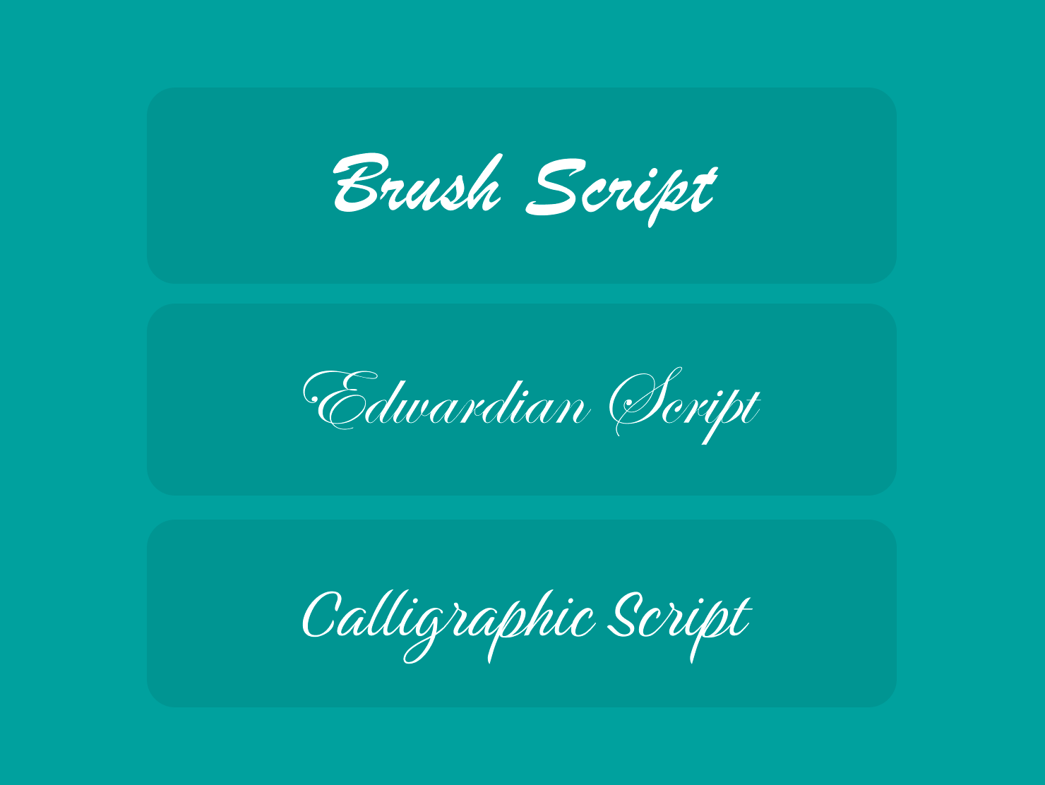
Script fonts are more like handwritten cursive, with flowing lines. They create a sense of elegance and formality. Examples of script fonts are Brush Script, Edwardian Script, and Calligraphic Script.
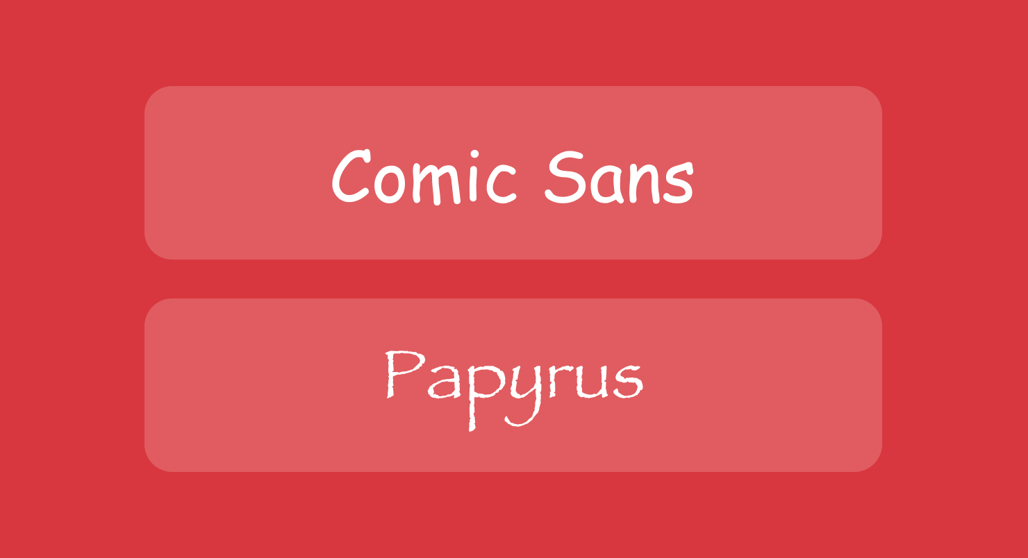
Decorative fonts can span a range of styles, but are in general more artistic and expressive. Often, designers use decorative fonts for displays or headlines. A few examples are Comic Sans and Papyrus.
Choosing the Right Font
When it comes to choosing fonts in desktop publishing, first and foremost you should consider readability and legibility. Can the words easily be read? Can each character be clearly recognized? Readers should not have to struggle to make out the words of your document. Among others you should choose whether the font will be Serif or Sans-Serif, font size and spacing between letters.
Serif vs. Sans-Serif
The first step to narrow down a font choice is to choose between serif and sans-serif fonts. Serif fonts, like Times New Roman, have strokes at the ends of letters, which help guide the eye along the text. They work best for printed materials like books or long documents.
Sans-serif fonts, like Arial, lack these decorative strokes, so they are cleaner and more readable on screens. Sans-serif fonts are more ideal for digital content or website copy.
Font Size and Spacing Considerations
After choosing serif or sans-serif, the next step is to think about the size and spacing of a font. It should be large enough to read, but not too large for the page. A reader should not have to strain to read the font, but you also don’t want to overwhelm the page. There is a balance to strike, and experimenting with a few fonts first can help you find the right one.
There are other spacing changes to consider that help your document be more readable. The spacing between pairs of letters, known as kerning, is important to think about. It is a small detail, however different fonts style the position of adjacent letters differently, and this affects the overall appearance of words. Smaller kerning can make it easy to read short pieces of text, or headlines, but it may be too crowded for a long document, though.
Spacing between lines, or leading is another element that gives the eye room to read easily. However, too much space between lines can have the opposite effect. And adjusting tracking, or letter-spacing of a font, affects the readability and impact of a document. Larger tracking means each letter within a word is more spaced out, which can help readers recognize letters better, especially in a delicate, smaller font.
Experimenting with these spacing features will help you choose what is best for your unique design. All the size and spacing details related to font styles contribute to making a document or text beautiful to look at, but also easy, or difficult, to read and understand.
Pairing Fonts Effectively
For most documents you design, you may want to use more than one font. This creates visual interest and helps keep the reader engaged. A key concept the best designers pay attention to is how to pair different fonts to create the best combination.
For example, pairing a bold, thick sans-serif font with a more subtle and legible serif font provides a definite contrast. This contrast can make the whole text easy to read, with the serif font, but also effectively convey a strong message, with the bold font.
The choice of a font’s size and weight also is part of pairing fonts. Headings are typically larger font sizes, which divides up a longer text, and creates a hierarchy to help the reader understand the overall message.
Finding Complementary Font Pairs
To find pairs of fonts that work well together, start by picking a typeface that has a variety of font styles. This is called a font “superfamily”, which means the typeface has several font choices in different categories: Serif, Sans-serif, Script and Decorative.
For example, Helvetica Neue is a typeface that includes a Serif and a Sans-serif version. Though the two versions of Helvetica Neue are different, they have some similar characteristics in their design. Another example is Futura, which is known for clean, geometric design. This font has both serif and sans-serif versions. In addition, to pair different fonts, you might use one font in an italic version and one in normal text version.
Pairings that are complementary but show some contrast help keep the visual identity of a document consistent, while giving enough difference to provide interest. They also aid the reader by breaking up the document visually, and understanding clearly the message you want to convey. Pairing fonts is an art, so trying out several pairs is the best way to find a good balance between different fonts for your design.
Tips for Using Fonts Effectively
To make the most of fonts in design, there are several good design principles to follow.
First is consistency. Keeping a font style consistent all through a document will give a professional appearance and make it simpler to read.
Second, limit the number of different fonts used in a document. There are thousands of beautiful fonts, and it can be tempting to try to use many favorites that catch your eye.
But it is important to not use too many fonts in the same document. Doing so can be visually confusing, so the best rule is to stick to a small selection of two or three fonts to keep your design coherent.
Thirdly, it is a good principle to keep font formatting consistent within your document. If you decide to use bold font or italic font in headlines, use them in all headlines. If you use one size font for paragraph text, use it throughout. Consistent formatting in the style, spacing and size of fonts makes your design easy to understand and professional.

Resources for Finding Fonts
There is no shortage of places to find fonts, and if you're a font lover, you will enjoy the deep dive into websites offering free and paid font libraries. Google Fonts is an open source library of fonts useful for web design and desktop publishing.
DaFont is another valuable online resource with a huge array of downloadable fonts for personal use. You will find hundreds of artistic font styles, in decorative, script, display, and more. Many of these fonts are free for personal use.
Font Squirrel is another library of fonts for projects of all kinds. Many of these fonts are available for personal and commercial use.
A few more font libraries online worth exploring are:
- 1001 Fonts–over 50,000 free fonts, with new fonts added often.
- Fontspring–professional fonts with licensing available, and most are paid.
- MyFonts–the largest selection of professional fonts, with a blend of free and paid fonts.
- Creative Fabrica-provides a vast library of fonts, graphics and more via paid subscription or free.
Conclusion
Selecting the right font is a critical part of design that can impact the success of a project. But overall, the art of choosing fonts extends beyond aesthetics. It is centered around knowing the purpose of your document or design, and understanding your audience well.
With these in mind, you can make sure the typography you choose is intentional, and communicates clearly to your reader or audience.
Whether you are creating a flyer, brochure, greeting and business card or designing an entire book for printing, fonts are the primary way to get your message to your audience and create an impression.