Preparation Stage
One of the main aims of a poster is to attract attention. That’s why it is vitally important to brush up on poster creation with the help of our new tutorial and experiment with various colors, forms, text formats, etc. to find out how to make a poster in the most effective manner and functionality of Swift Publisher will be useful here.
Create a series of posters and compare their advantages and shortcomings. For instance, the color red promotes the achievement of goals and leads to fast actions and decisions, while blue shades evoke a calm and pleasant mood. Men and women also view colors differently. According to an American college in Brooklyn, a man’s eye needs a longer lightwave than a woman’s to view the same color (e.g., orange seems to look redder to men, and grass appears more yellow). Besides, men find it harder to distinguish between shades of green, yellow and blue. The difference in color view is based on the structure of the eye and hormonal balance. Therefore, you might want to consider this factor once you have achieved your project’s objectives.
Choose the Proper Size
Depending on the target location of a poster, its size may vary. Take this parameter into account when designing your poster. If you have a long distance between a viewer and this object, it is recommended to choose bright and large details to attract attention. The text should be readable in different scales.
Also, don’t hesitate to print full-sized drafts of your future poster to give you a better understanding of how you can improve it.
If you are going to print a poster, your decision-making on sizes should be well thought out. Of course, you can consult with a chosen printshop to define the most appropriate solution, but your own analysis and research will come in handy as well. Here are some of the crucial factors to consider to make any poster you print a fabulous representation of your work and diligence:
- The choice of size is frequently defined by the paper selection. Depending on the agency you select, a bulk offset printing process of 8.5″ × 11″ of over 200 units can be possible on the text and cover stock. At the same time, styrene, vinyl and some other paper options are available for digital printing. Regardless of the paper selection, however, acid-free paper is a must-have. This is necessary to avoid the material turning yellow after a long time hanging in the target place.
- Don’t forget to match your needs, expectations and budget. If you are going to get a batch of printed posters, selecting an expensive canvas shouldn’t lead to bankruptcy. For each widespread poster size, there will be myriad paper variants and prices.
- Choosing the biggest size printed on the best paper seems the only solution to achieve premium attraction. In reality, a lot is defined by the target location and how much time this poster has for advertising valid information. For outdoor posters, more durable paper must be selected.
- Personal preference is surely important as well. While someone is fond of brilliant high-gloss paper, others are more interested in specific textures that are pleasant to the touch.
| Name | Size in Inches | Size in Millimeters |
|---|---|---|
| ANSI A (Letter) | 8.5 × 11 | 215.9 × 279.4 |
| ANSI B (Tabloid or Ledger) | 11 × 17 | 279.4 × 431.8 |
| Mini-Poster | 12 × 18 | 304.8 × 457.2 |
| Portrait Poster | 16 × 20 | 406.4 × 508 |
| Medium Poster | 18 × 24 | 457.2 × 609.6 |
| Large Poster | 24 × 36 | 609.6 × 914.4 |
| Movie Poster (for “guerilla” marketing campaigns) | 27 × 39 | 685.8 × 990.6 |
| One Page Movie Poster | 27 × 40 | 685.8 × 10¹⁶ |
| Academic Poster | 48 × 36 | 1219.2 × 914.4 |
| Bus Shelter Poster | 40 × 60 | 1016 × 1524 |
| Bus Shelter Poster | 46 × 67 | 1168 × 1702 |
Main Elements of a Poster
Every unique poster layout is a combination of different design components. A poster without relevancy and correlation between different elements will strike no importance with the audience. Therefore, it is essential to design your poster by enlisting and considering the most important components, as described below.
White Space
The first and foremost design aspect is the use of white space, which defines the border of your poster presentation. Additionally, it will create a more readable and organized pattern.
For best results, it is advised to allot 30% of the layout to the white space. In this manner, you can achieve an optimum design while incorporating text and graphics in your poster.
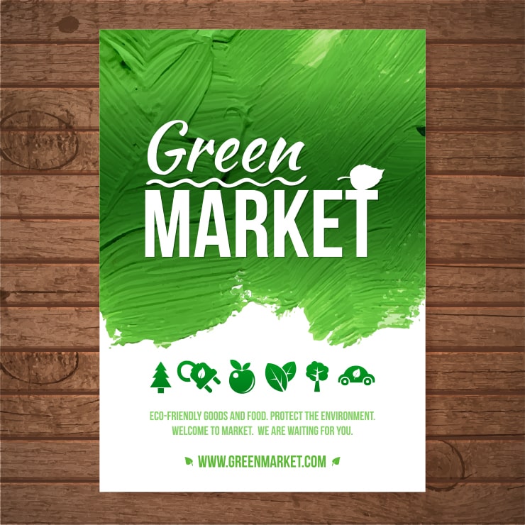
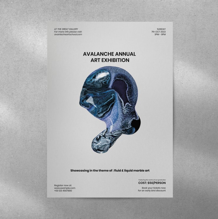
Poster Title
The title is undoubtedly the most eye-catching component of a poster. The wording of the title must be simple, and it should have words that grab the attention of the audience and compel them to check the rest of the poster.
It is best to use a 48-point font and bold text for poster titles. By sticking to these features, you can make your titles easy to read from a distance. Lastly, poster titles must be brief—they should cover posters’ themes using the minimum number of words.
Text
The text describes the general body of a poster. You should only discuss the relevant points and stick with the topic rather than beating around the bush. You must use text in a precise ratio, along with graphics and white space. Most professional poster designers recommend dedicating 40% of the poster area to text.
Graphics and Color Scheme
Graphics are the imagery flowchart of the poster. Therefore, you must use utterly relevant images and arrange them according to the flow. Moreover, you also need to have high-quality images that are easily visible from a distance of at least 5 feet.
Regarding the color scheme, don’t mess up your design by cluttering it with multiple colors. For best practices, it is recommended to use a maximum of three colors in a single poster.
Adding Images to a Poster
You must be careful when adding images as they are the visual presentation of your poster and its idea. Keep in mind the below-mentioned points while choosing and using images for your poster.
Copyright Images
Keep an eye out for image copyrights, because copyright violations may create huge problems.
An alternate approach is to use royalty-free images, such as those found in a Google Images search under the Creative Commons’ license tag or in Swift Publisher’s additional clipart pack.
Image Resolution and Quality
The minimum resolution for the image should be 1024 × 768 to make it visually appealing and attractive. You must not compromise on the image quality as it will jeopardize the visual representation of your poster.
Use Helpful Software
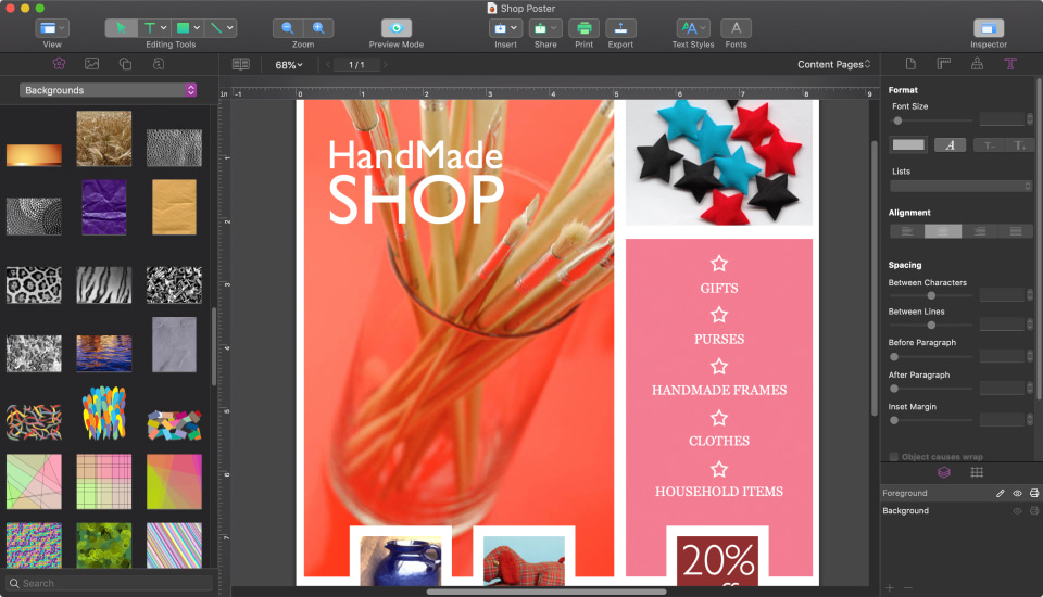
Without a doubt, many designers consider posters to be simple projects to create. However, you can’t do a quality job with them “barehanded.” For this purpose, multifunctional solutions like Swift Publisher (with a user-friendly interface and smooth navigation) will come in handy.
Conclusion
If you want to create posters without difficulty and then print them with ease, Swift Publisher is a great example of the program to select. With the help of such supporting software, each poster will be a unique masterpiece.
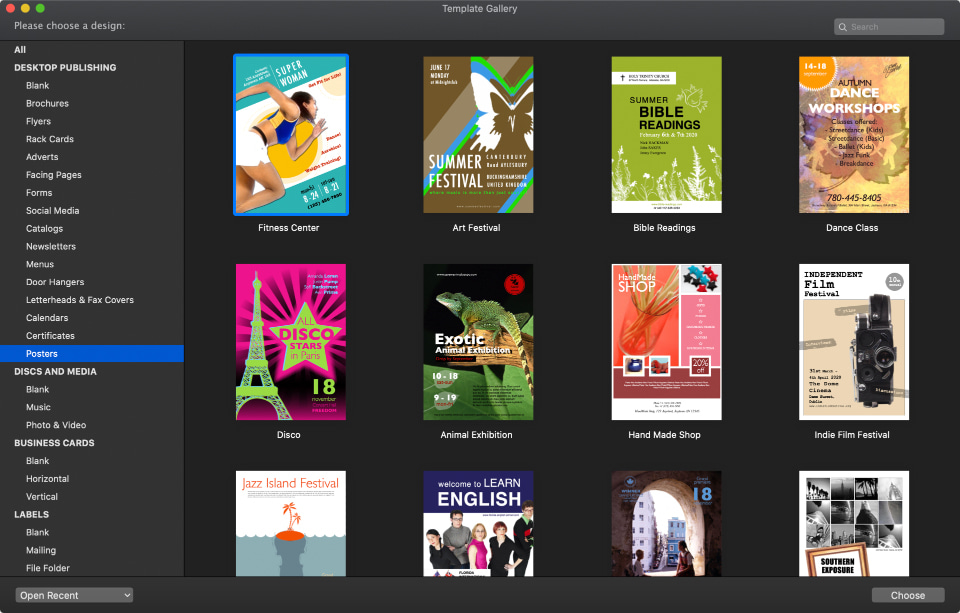
With over 500 professional templates, a rich collection of tools to adjust and customize the information, different modes of work and a substantial clipart collection, it has never been easier to create numerous types of posters on your Mac.