Marketing Psychology of Colors: The Importance of Color Meanings
The world around us includes so much information that 100% of conscious operation and analysis is absolutely impossible. Every detail is meaningful, as well as the triggers that help evoke particular emotions.
Without a doubt, there are several spheres in which the benefits of such a non-direct influence can’t be underestimated. Accordingly, we closely examine the psychology of color in marketing and apply it to attract as many target users as possible.
Intrigued? Let’s learn more about the colors’ power over your mind!
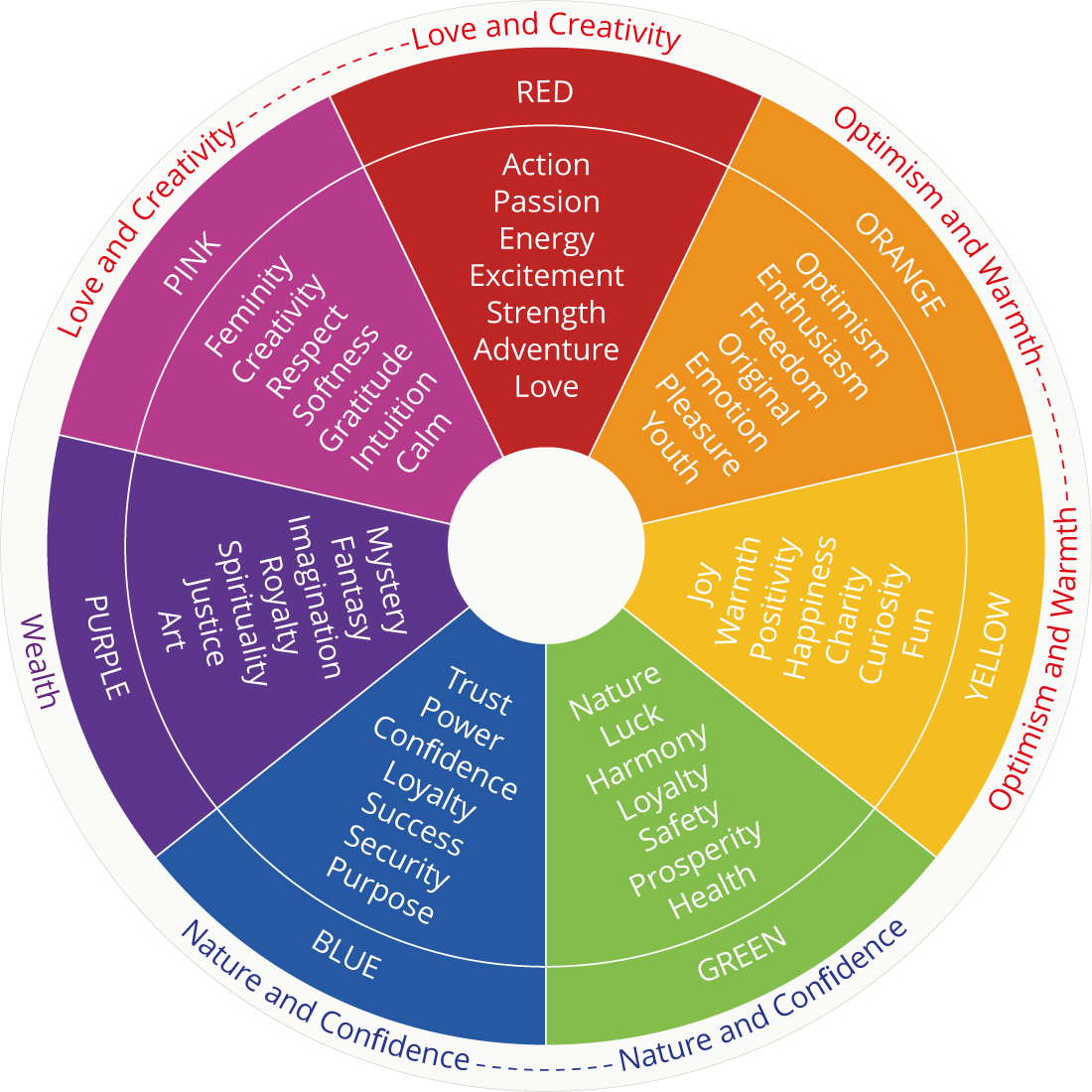
Red
What do you feel when you look at red objects? Red is a realization of strong and somewhat extreme emotions. Anger, danger and passion are often associated with this hue. For these reasons, sports cars are often designed using red shades.

In the spectrum of all the shades, this one is ranked first for its attention-catching abilities. There are numerous warning signs and vehicles that use red (e.g., fire engines, stop signs). In marketing, it is often effective to use this tone in sales.
The main influence of red is that it pushes people to make fast decisions that result in impulse purchases.
Blue
In the case of blue, the opposite is true. Unlike red, this color is associated with honesty and security. There is no need to rush. A powerful example of the strength of blue is represented in the following scenario: Glasgow’s crime level decreased drastically when blue lighting was installed on its streets.
This color is also used to catch the attention of cautious buyers. It is very helpful to create your website in blue tones, especially those parts in which a consumer needs to provide you with his credit card details or other personal information.
Green
Just look around you and imagine you are somewhere in the woods, breathing fresh air and taking in those incredible smells of nature. As with blue, green is associated with safety but with more freshness and clarity. So, a lot of manufacturers utilize this color in food packaging. Nowadays, green also signifies that your product is environment-friendly and lacks some harmful chemicals and substances.
Green is also a symbol of luck in several western cultures, so this psychological effect can be used when creating specific lotteries or promotions.
Purple
If you want to represent royalty in a color, then purple will be your perfect choice. At the same time, purple tones are often used to style mysterious and magical things. Consequently, purple is an effective solution for beauty industry packaging, especially for various anti-aging products.
Yellow
Another bright color that can boast of premium attention-catching abilities is yellow. Unlike red, this tone represents life’s richness, energy and happiness. Such a shade will increase the level of people’s creativity and have a positive effect on their mood. Therefore, it is a wonderful decision to add yellow tones when decorating a shop window.

Pink
Thanks to advertisements and long-term traditions, pink is typically associated with girls. Sweet, nice, fluffy, cute... if your brand can be described like that, then a pink tone is the ideal option for you.

At the same time, pink suggests kindness, friendship and love. Combinations of pink and red can create a highly romantic and sincerely warm atmosphere.
Orange
The effects of orange are very close to that of yellow, except that orange is a more adult and mature hue. Nowadays, this color is highly associated with affordable sales prices. For instance, some Amazon sections and particular budget-friendly airlines utilize orange to welcome provident consumers.

Color Combinations
Being acquainted with the separate effects of each tone, you can easily combine them to create the desired effect on your target customers. For instance, the McDonald’s logo is red and yellow. Briefly, that means the purchases are made fast and with fun. If you need a stricter and more striking effect, feel free to use classic black and white combos.

The Theory of Colors
When noticing color palettes that represent different brands and products, you can uncover insights into why designers and marketers chose each color. These insights come down to the principles of color theory. In design and branding, picking a color combination is not a haphazard process. Whether in visual design, brand identity, packaging or any creative endeavor, there is intention behind color combination choices. And, as a creator or artist, you can learn how to combine colors for a certain purpose by understanding the basics of color theory.
Basics of the Color Wheel
First, the foundation for understanding color theory and the relationships between colors are represented in a visual tool called a color wheel. The color wheel shows colors, categorized into primary, secondary, and tertiary colors. It also represents different color harmonies, like complementary, analogous and triadic color combinations. These relationships are key principles in color theory. The color wheel provides a visual framework for knowing how to choose colors and knowing which colors can be grouped together for different effects.
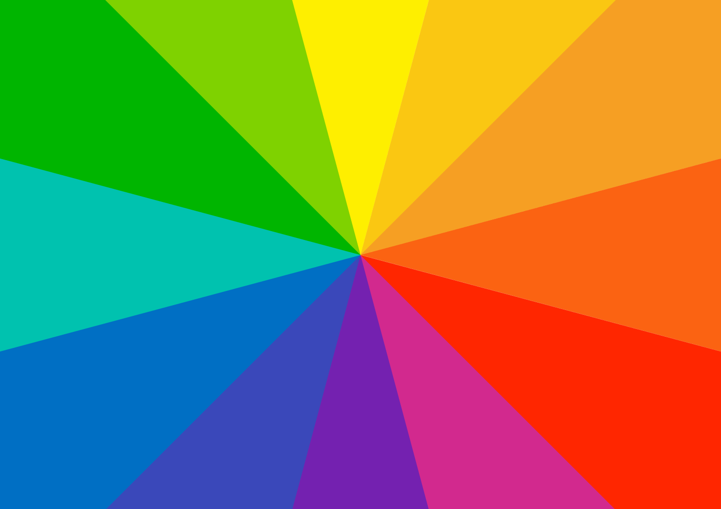
Variations of color around the wheel demonstrates how colors should be used together, based on their relationships. The wheel translates principles of working with color into a visual guide. And color theory is the perfect guide to help you select effective, visually beautiful color combinations.
Primary, Secondary and Tertiary Colors
The primary colors of red, blue and yellow serve as the building blocks for all other colors. They can’t be formed by mixing other colors.
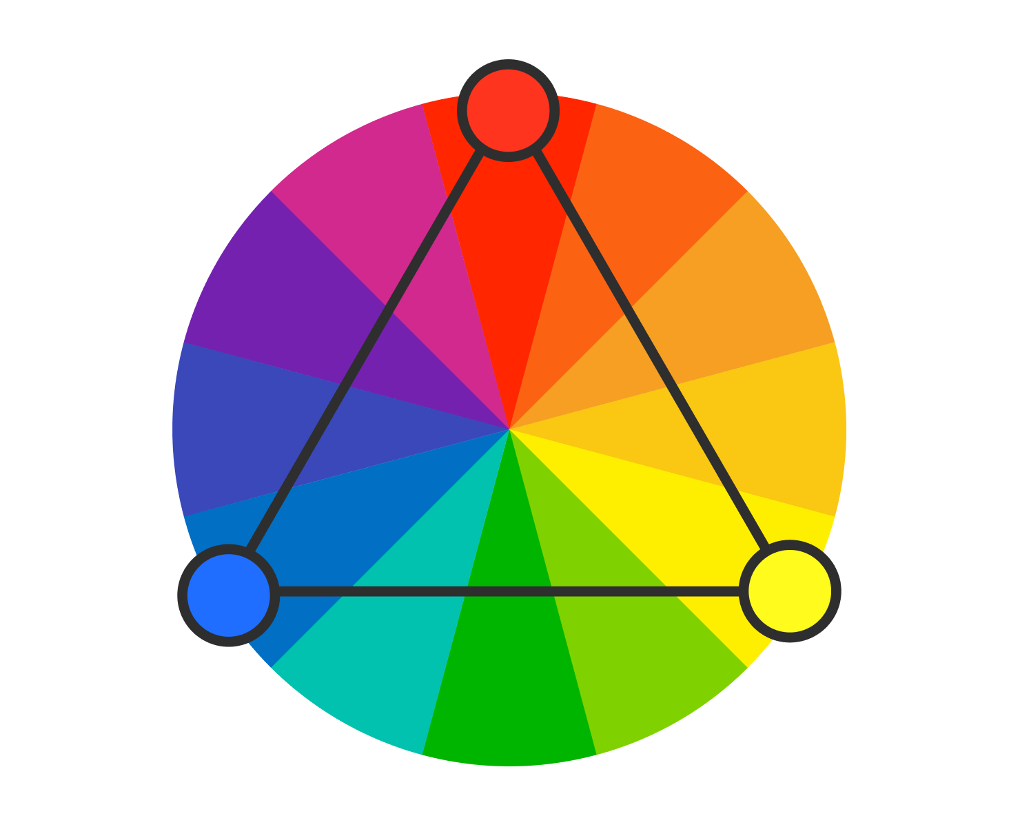
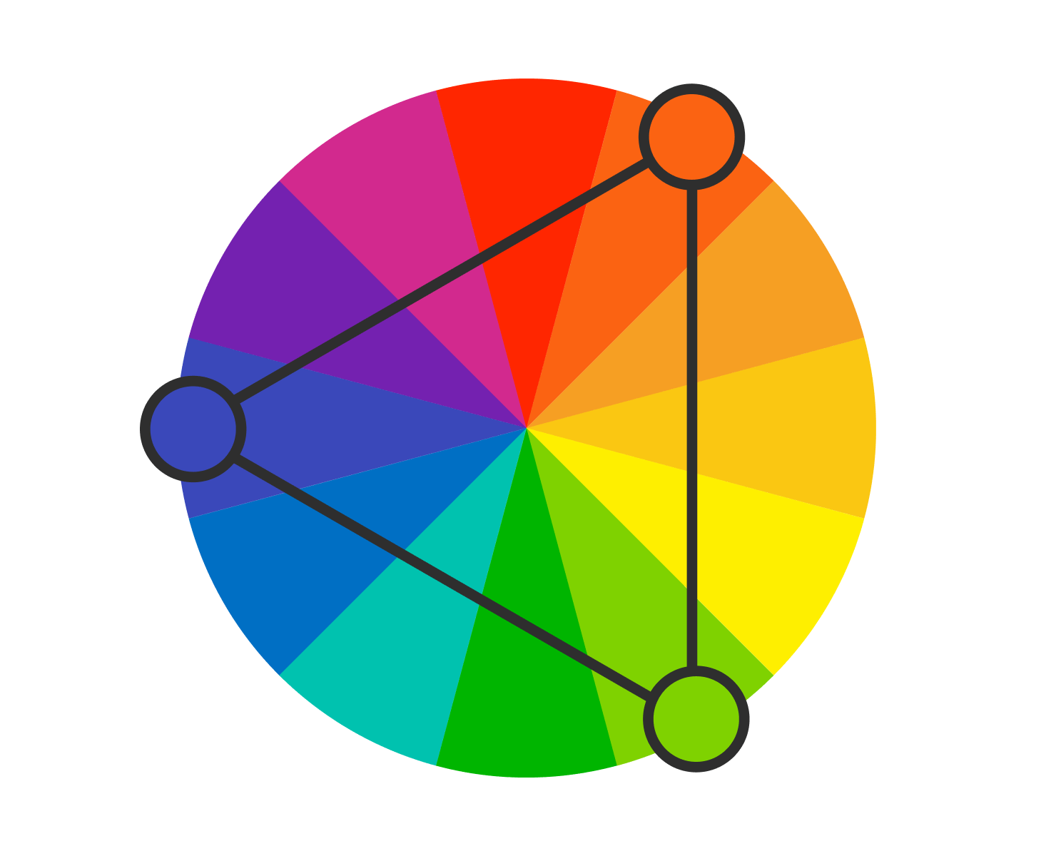
Secondary colors are green, orange and violet. These are made from mixing two of the primary colors. Red and blue for purple; red and yellow for orange; and blue and yellow to make green.
Tertiary colors are those that result from mixing one primary color with an adjacent secondary color on the color wheel, like red-orange and blue-green. Tertiary colors give more complexity to color choices, and allow designers to create more sophisticated color palettes in their applications.
Color Harmonies: Complementary, Analogous, Triadic and Split-Complementary
Understanding the four main color harmonies is the central to selecting color combinations to suit the purpose of your design or text.
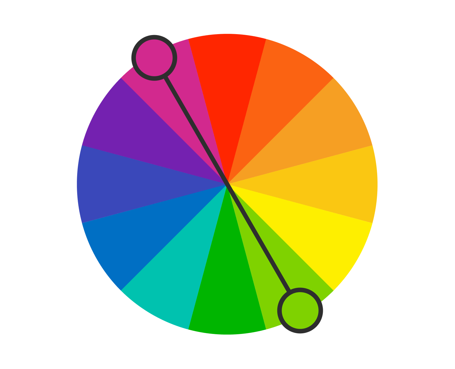
Complementary colors are located directly opposite each other on the color wheel. Their opposing relationships means they offer a high visual contrast when paired together. Complementary colors should be used to create impact or draw attention to something. But they should not be used right next to each other, because the high contrast is not visually easy to interpret. Text and background in complementary colors is also not usually legible.
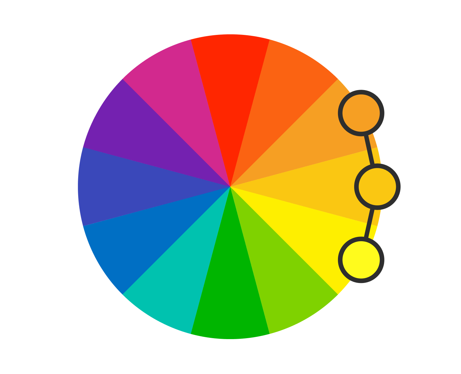
Analogous colors are those grouped next to each other on the color wheel. Since they are closely related, these colors offer a low-contrast combination. Analogous colors are ideal to use as accents to one main color choice. If your aim is to evoke a sense of calm or create a connection with nature, analogous color groupings are perfect. These colors are also helpful to add visual interest in a mostly monochromatic color scheme.
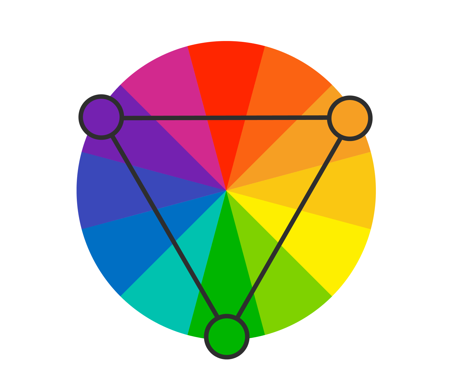
Triadic colors are those that are spaced evenly around the color wheel, forming a triangle in their shape. A triadic palette gives both color contrast and harmony, so these used together are eye-catching. Triadic palettes are common in marketing logos, because while they stand out due to the contrast, they also offer harmony, giving a real visual balance.
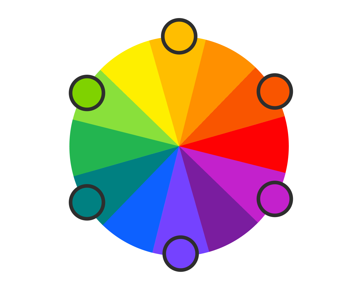
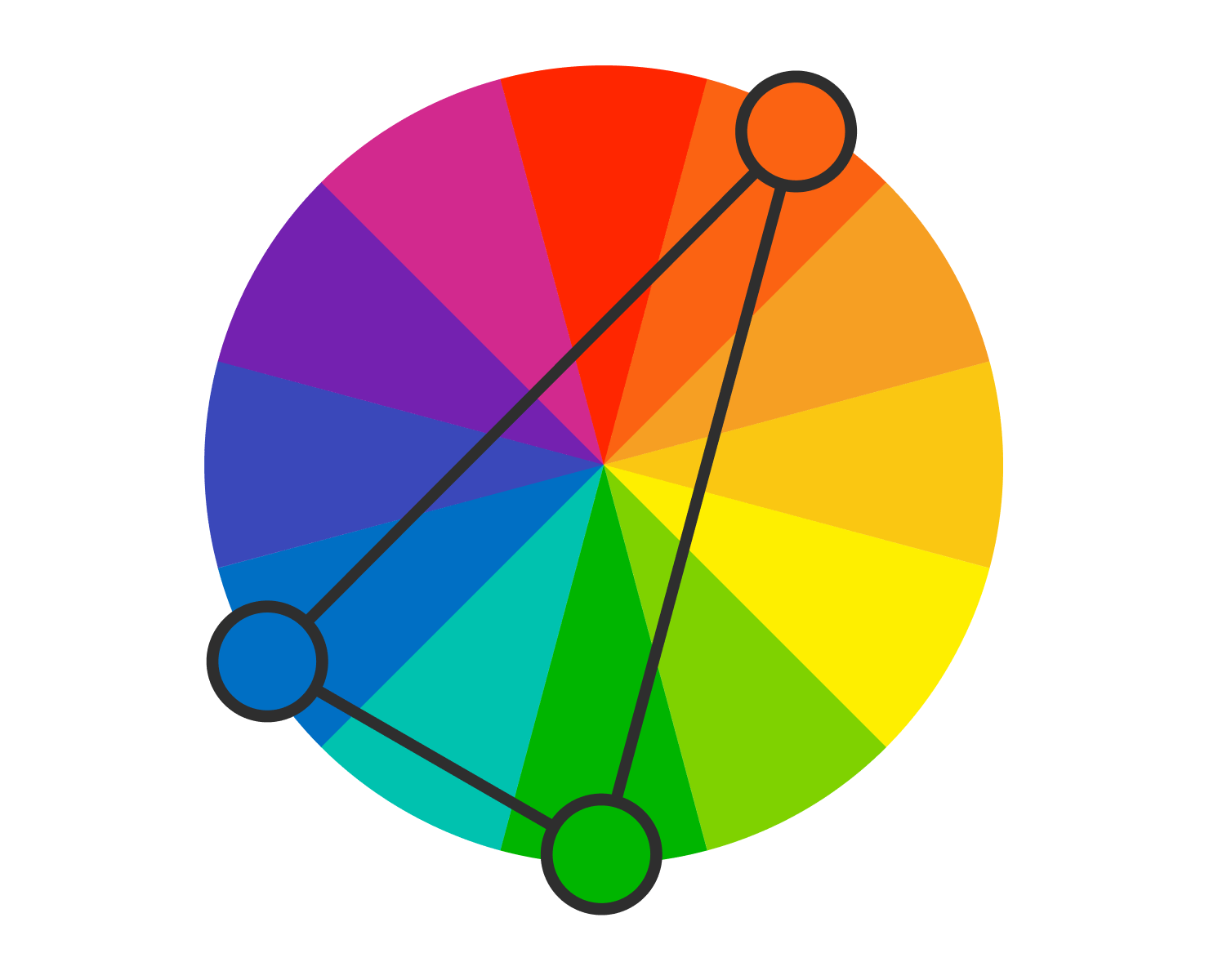
A fourth color harmony is split-complementary colors. A split-complementary color combination uses one main color and two complementary colors that are directly opposite the main color on the wheel. This color scheme allows for some contrast, like a traditional complementary color arrangement. But it also incorporates a color close to the main contrast color. This palette gives off an adaptable vibe. It’s a good choice for beginner designers or those who are hesitant to make too much of a statement with their color palette.
Importance of Accessibility and Contrast
When selecting color combinations, it is critical to choose colors that provide enough contrast to be seen by all.
Primary colors of red, blue, and yellow, often serve as a starting point for designs since they provide a strong foundation for accessible designs. When used with one another, or with black or white, these give a noticeable contrast.
Secondary colors offer a wider range of possibilities for achieving accessibility. They can enhance the readability of content when combined with primary colors or neutrals. Tertiary colors add subtlety to a design while maintaining accessibility. They provide an opportunity to create visually appealing color combinations, but designers must pay close attention to the contrast between tertiary colors and the background or surrounding elements to ensure accessibility.
When working with color harmonies—complementary, split-complementary, triadic, and analogous—each have unique applications in accessibility. Complementary colors, for instance, can create strong contrast and readability when used together, but too much use of this harmony can create strain.
Split-complementary schemes, on the other hand, can offer a more balanced and accessible contrast by incorporating analogous colors. Triadic and analogous harmonies provide opportunities for a harmonious visual blend that can still be accessible when the right contrast ratios are applied.
Wrap It Up
A manual approach is beneficial, but, if you are looking for a more time-saving method to play with colors and investigate their powers depending on different proportions, then using a professional software program is a must. Theoretical knowledge is best tested in practice, for sure.