Mastering Core Image Filters in Swift Publisher to Create Stunning Photo Effects
Creating stunning publishing documents such as flyers, brochures, or scrapbooks with Swift Publisher on a Mac often requires more than just basic image cropping and tinting. When your design ideas demand advanced photo editing, you might assume you need a separate, dedicated photo editing software, but in fact, you don’t.
Swift Publisher leverages the powerful macOS Core Image framework to deliver professional-grade photo effects directly into your workflow. Let’s pull back the curtain on the built-in photo filters available in Swift Publisher, discover the unique effects they produce, and learn how you can use them to completely transform your next desktop publishing project.
Using Core Image filters in Swift Publisher is incredibly easy, simply double-click any image or photo in your document.
The Foundation Tools: Crop and Transform
Before we get into the fun stuff like vortexes and light beams, we have to talk about geometry. Crop and Transform are the bread and butter of your layout.
Think of Crop as your director’s chair. It’s not just about cutting off the edges of a photo; it’s about reframing the story. By cropping tightly on a subject, you remove the visual noise and force the reader to look exactly where you want them to.
Transform is your physical placement tool. It allows you to scale, rotate, and skew. Using the Transform tool effectively ensures your images don’t just sit on the page; they interact with it.
The Color Section: Setting the Emotional Tone
Color is the fastest way to communicate a mood. If your photo feels off, the Color section is your first stop.
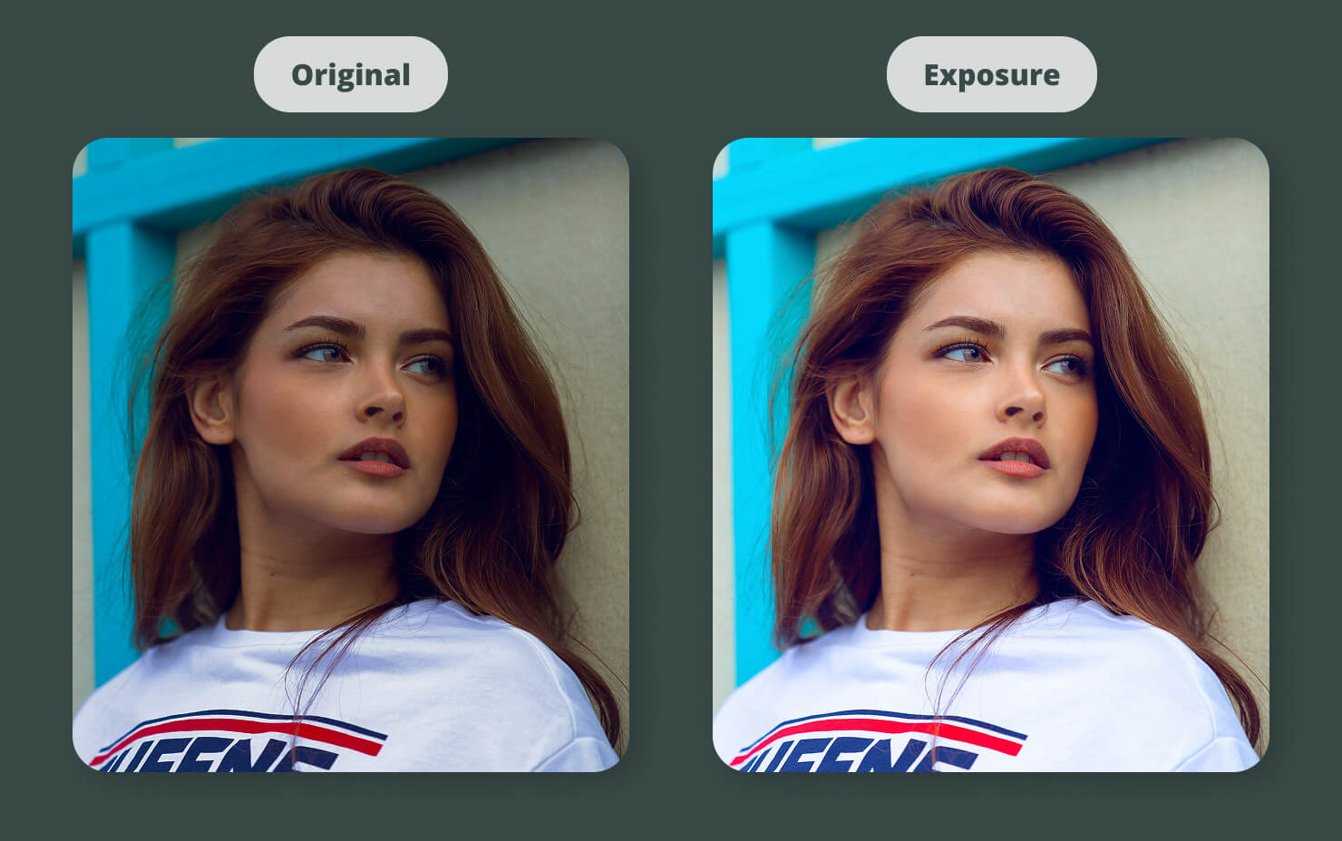
Precision Light Handling: Exposure and Gamma
If a photo is too dark, Exposure Adjust is your flashlight. But be careful—cranking exposure too high can blow out the highlights. That’s where Gamma Adjust comes in. Gamma targets the mid-tones, allowing you to brighten the heart of the image without losing the detail in the brightest spots. White Point Adjust is another lifesaver; it allows you to correct the temperature of a photo. If your indoor shots look too orange, a quick white point adjustment can make them feel natural and crisp.
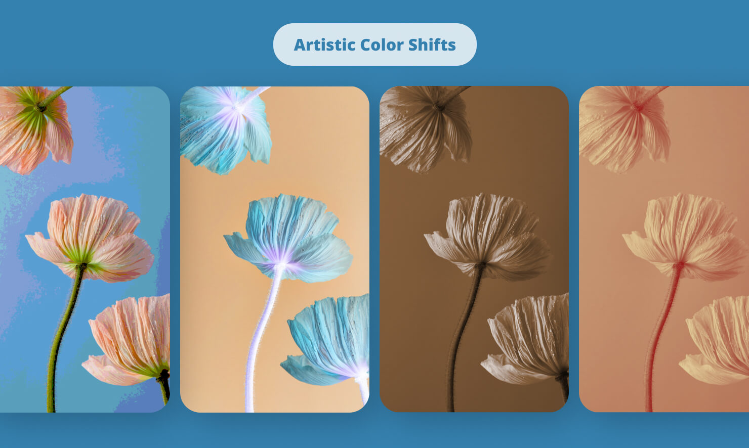
Artistic Color Shifts: From Posterize to Invert
Sometimes, you don’t want realism. Color Posterize reduces the number of colors in an image, giving it a cool, silk-screened aesthetic. If you want something avant-garde, Color Invert or False Color can turn a standard portrait into a piece of pop art. For those looking for brand consistency, Color Monochrome and Bi-Color allow you to force any photo to match your document’s specific color palette.
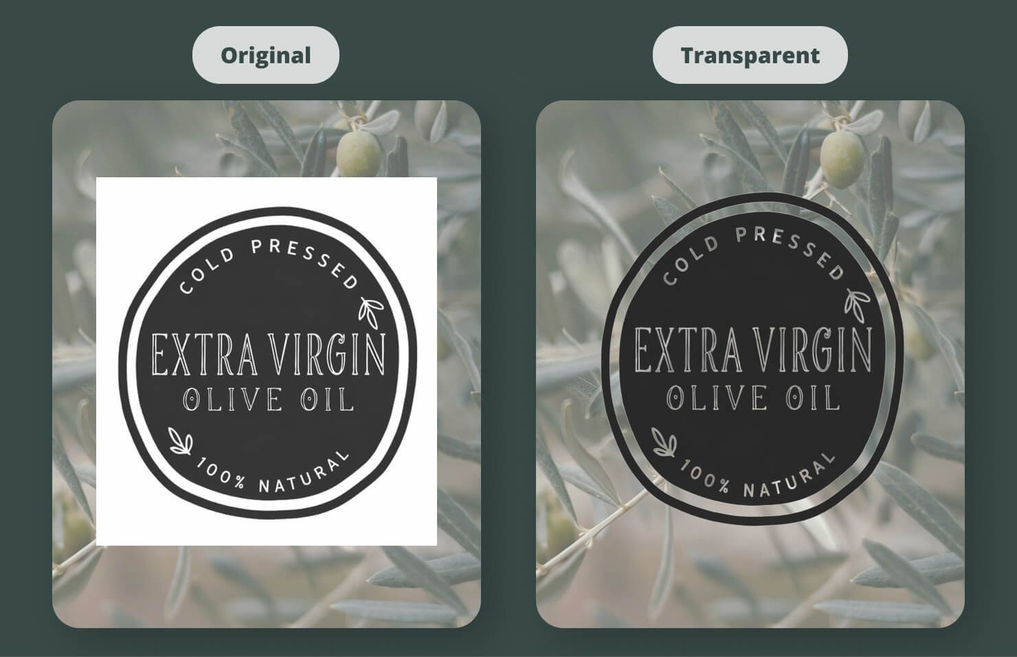
Solving Transparency Issues With Transparent Color
Have you ever had a logo with a white background that ruins your dark layout? The Transparent Color filter is your magic wand. It allows you to select a specific color and make it vanish, letting your background texture show through. It’s a huge time-saver that keeps you from having to jump back into a photo editor.
The Focus Section: Directing the Viewer’s Eye
Focus is about hierarchy. In a busy layout, you use focus to tell the reader what is a priority and what is just atmosphere.
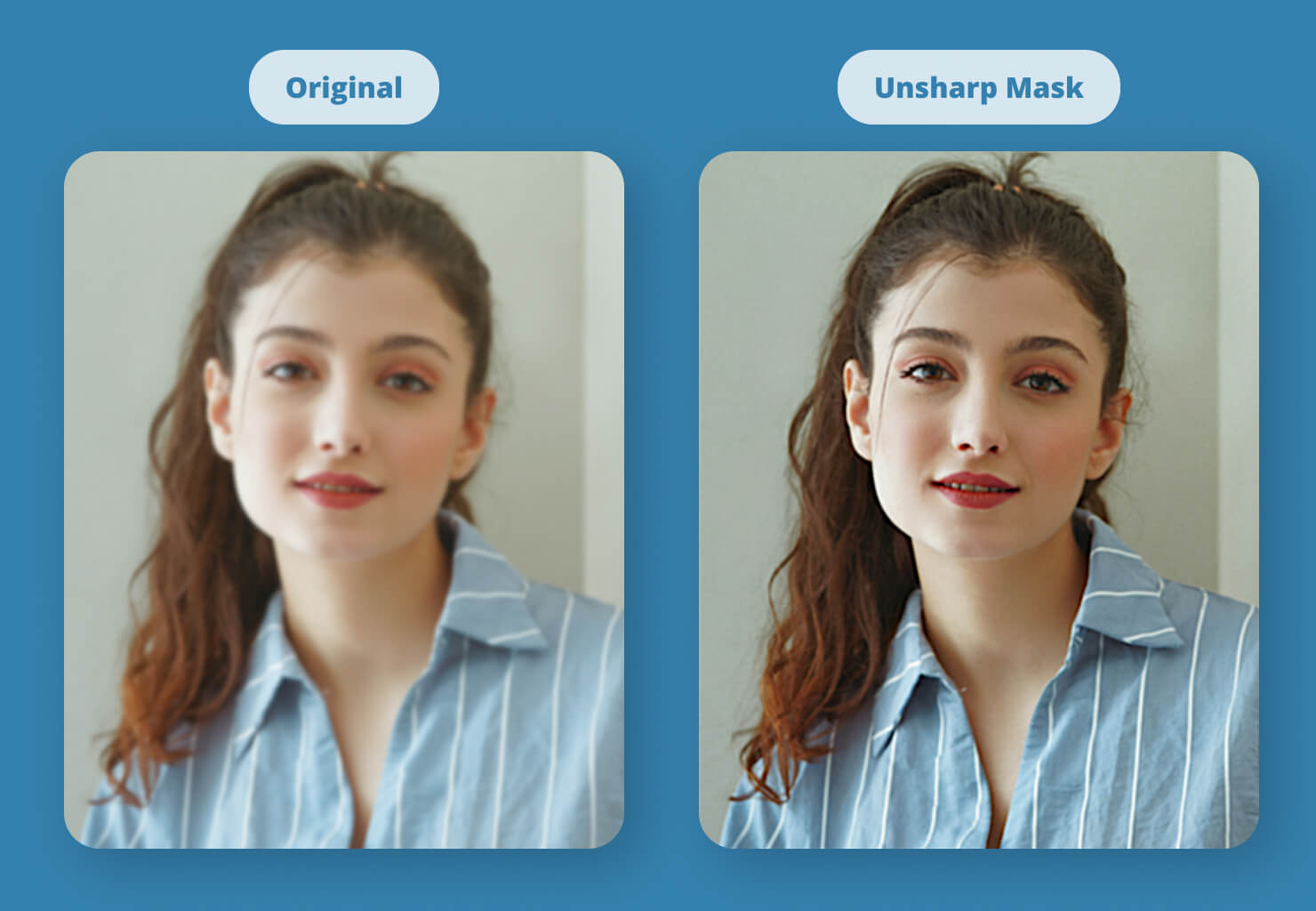
Bringing Clarity with Unsharp Mask and Sharpen Luminance
Despite the confusing name, Unsharp Mask is the gold standard for sharpening. It increases contrast along the edges of objects, making them pop against the background. Sharpen Luminance does something similar but focuses on the brightness detail, which is perfect for architectural shots or high-contrast black-and-white photos.
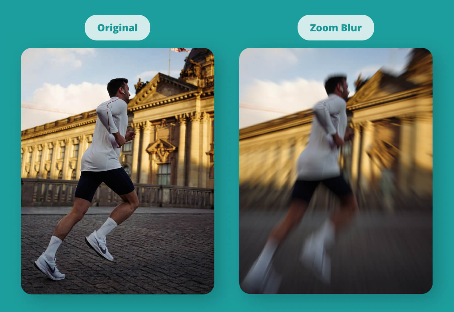
Creating Depth With Motion and Zoom Blurs
Blurs aren’t just for hiding mistakes. Motion Blur can give a static image of a car or a runner the illusion of incredible speed. Zoom Blur creates a tunnel vision effect that pulls the reader toward the center of the frame—perfect for dramatic headlines. And of course, a simple Blur is the best way to soften a background so that your text remains perfectly legible.
The Distortion Section: Bending Reality
This is the funhouse mirror of Swift Publisher. Use these when you want to get truly creative or create abstract backgrounds.
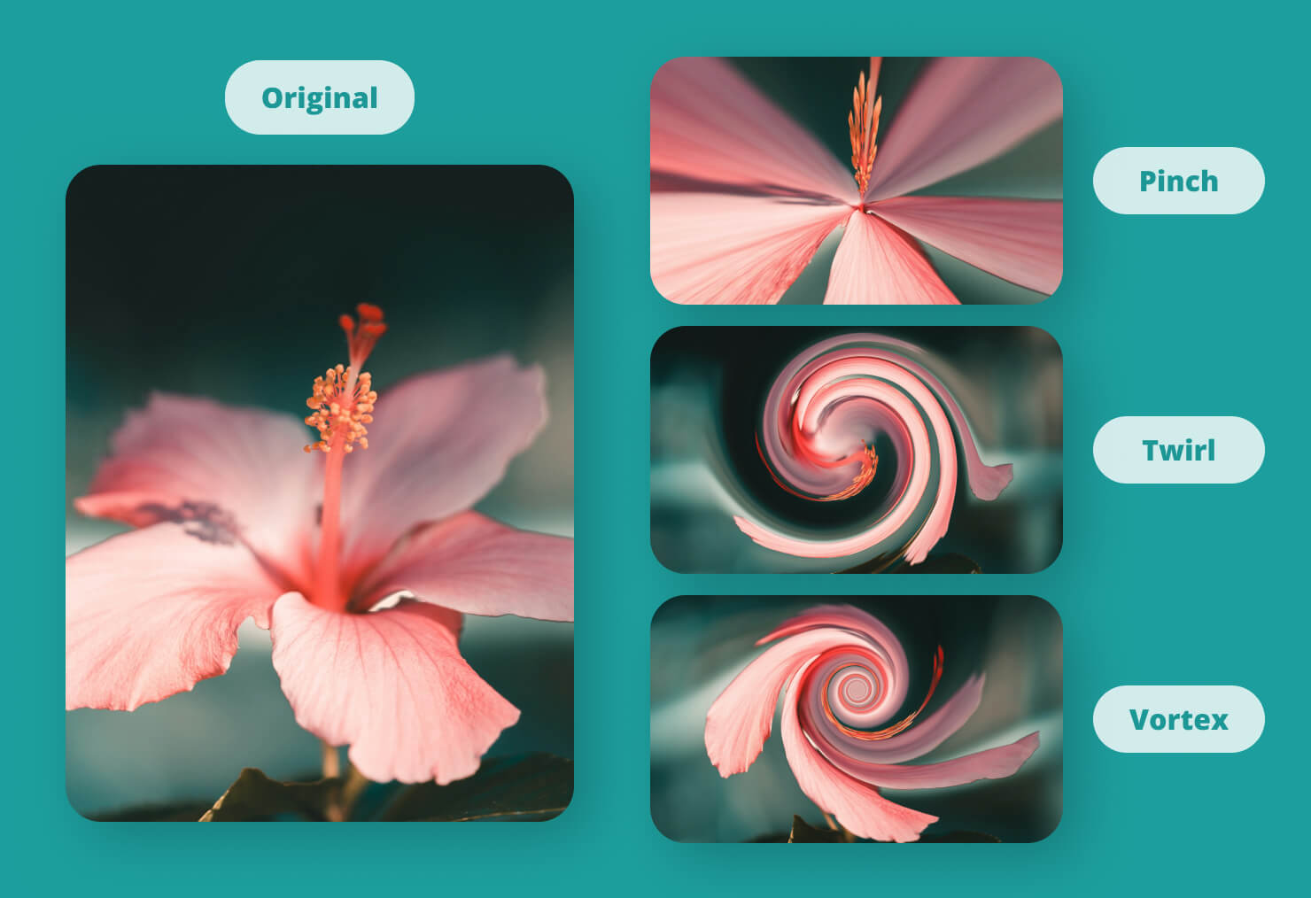
Classic Warps: Twirl, Vortex, and Pinch
Twirl Distortion and Vortex Distortion spin your pixels into a spiral. If you use these subtly, you can add a sense of swirl to water or clouds. If you use them aggressively, you can create a psychedelic masterpiece. Pinch Distortion is great for creating a fisheye lens effect, making the center of the image bulge or shrink.
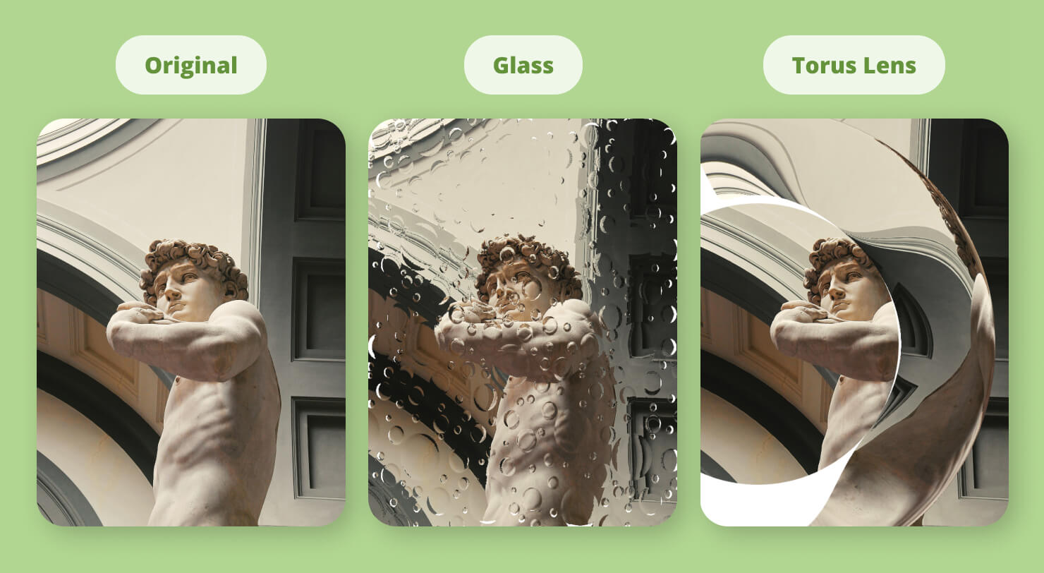
Unique Geometry: Glass and Torus Lens
Glass Distortion makes it look like your image is being viewed through a textured window, which adds an incredible layer of tactile feel to a digital design. Torus Lens creates a ring-like distortion that looks like a high-end camera artifact. These filters are perfect for creating sophisticated, abstract hero images for websites or brochures.
The Style Section: Adding Artistic Flair
The Style section is where you go when you want your images to look less like photos and more like digital art.
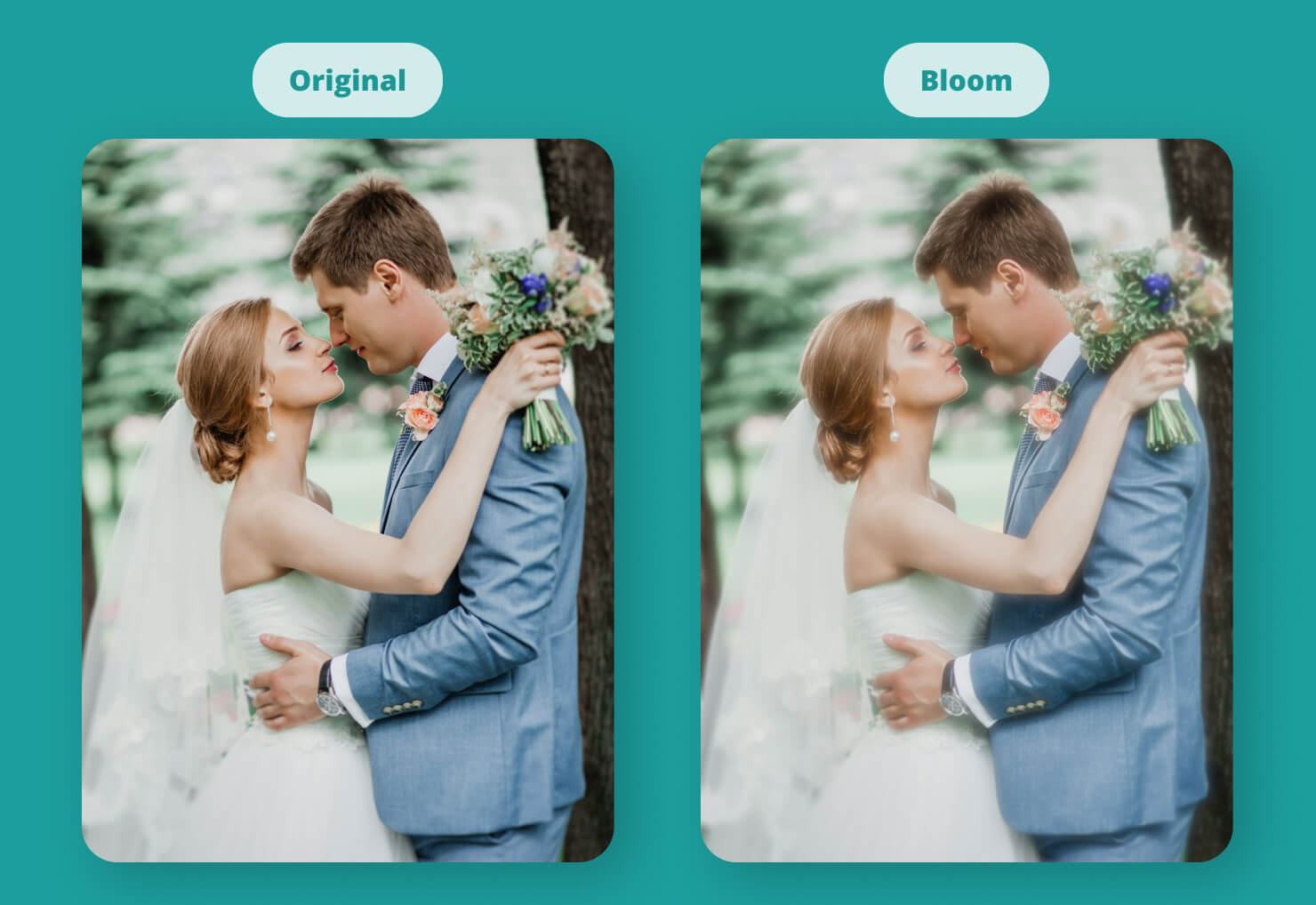
Light and Glow: Bloom and Gloom
Bloom makes the bright areas of your image glow, creating a dreamlike, ethereal quality. It’s a favorite for wedding invitations. Gloom does the opposite, darkening the shadows and creating a moody, cinematic atmosphere.
Digital Textures: Pixellate and Crystallize
If you need to hide someone’s face or just want a retro computer look, Pixellate and Hexagonal Pixellate are your go-to tools. Crystallize turns the image into a series of jagged polygons, which can create a stained glass effect that looks stunning when used on high-contrast photos.
The Halftone Section: That Retro Print Look
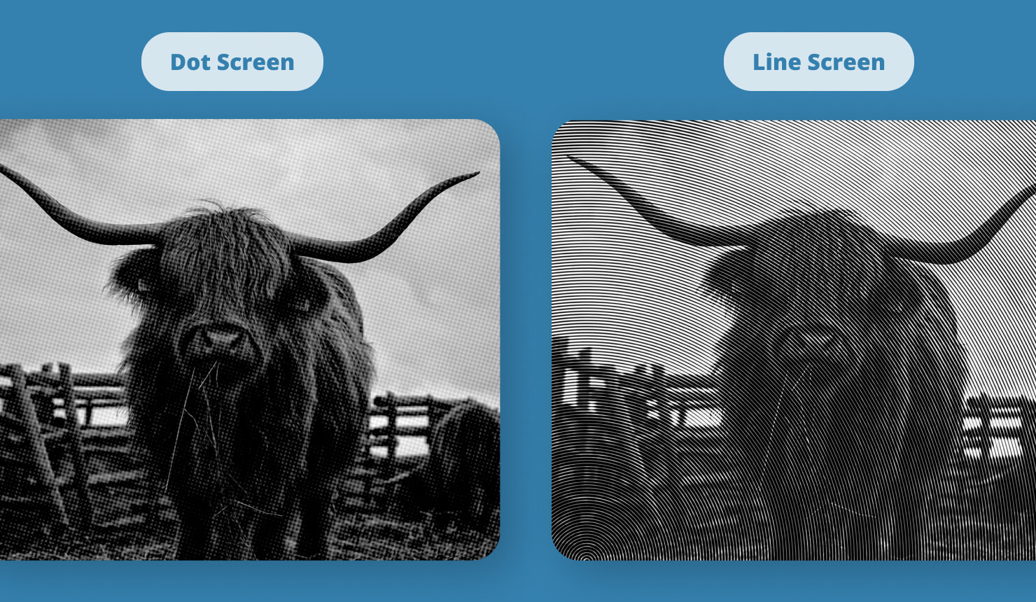
Do you love the look of old comic books or 1950s newspapers? The Halftone section is for you. CMYK Halftone mimics the four-color dots used in traditional offset printing. By applying this to a modern photo, you instantly give it a vintage soul. Dot Screen and Line Screen offer variations of this, allowing you to create that pop art texture that works so well for modern flyers.
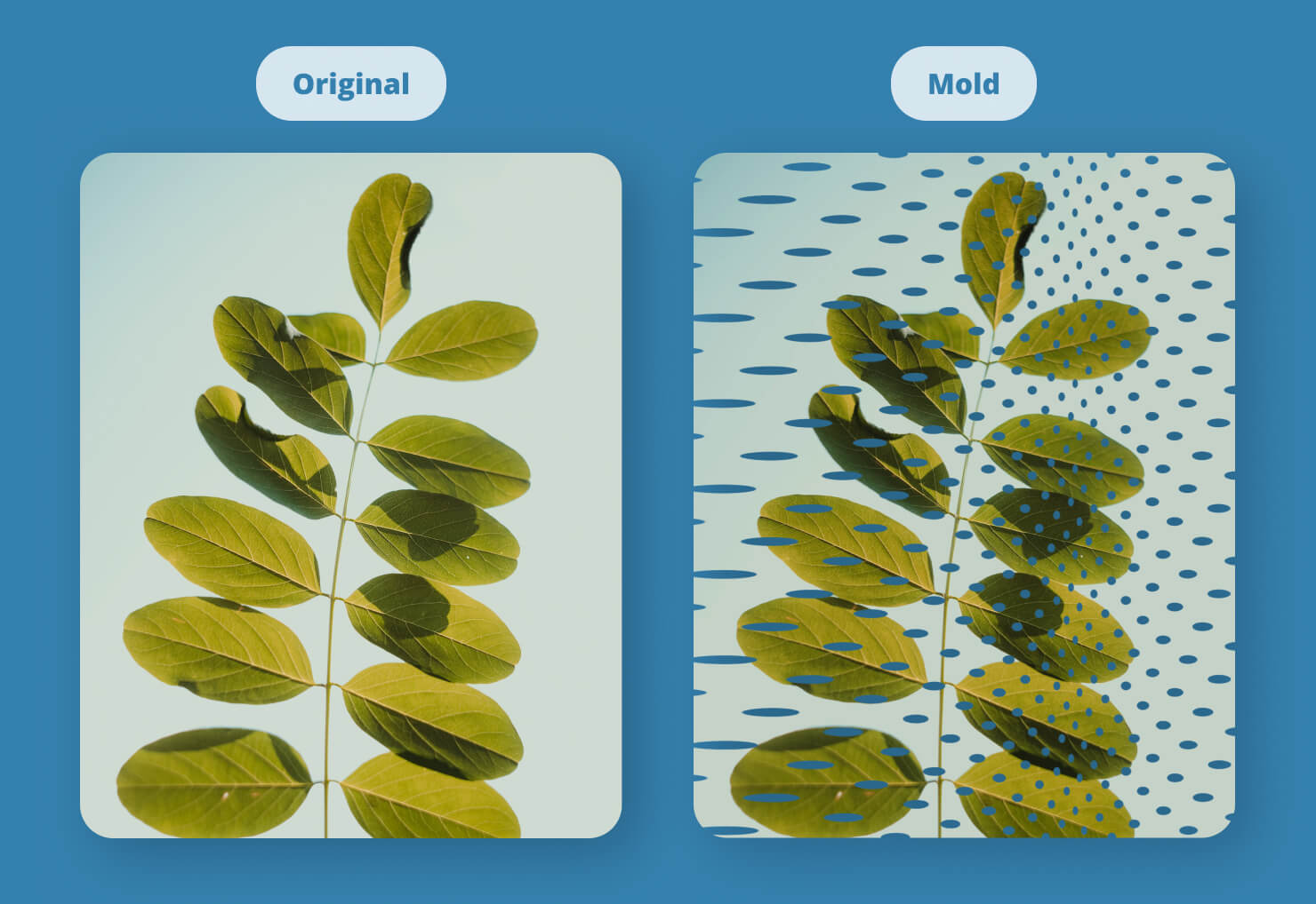
The Tile Section: Creating Infinite Patterns
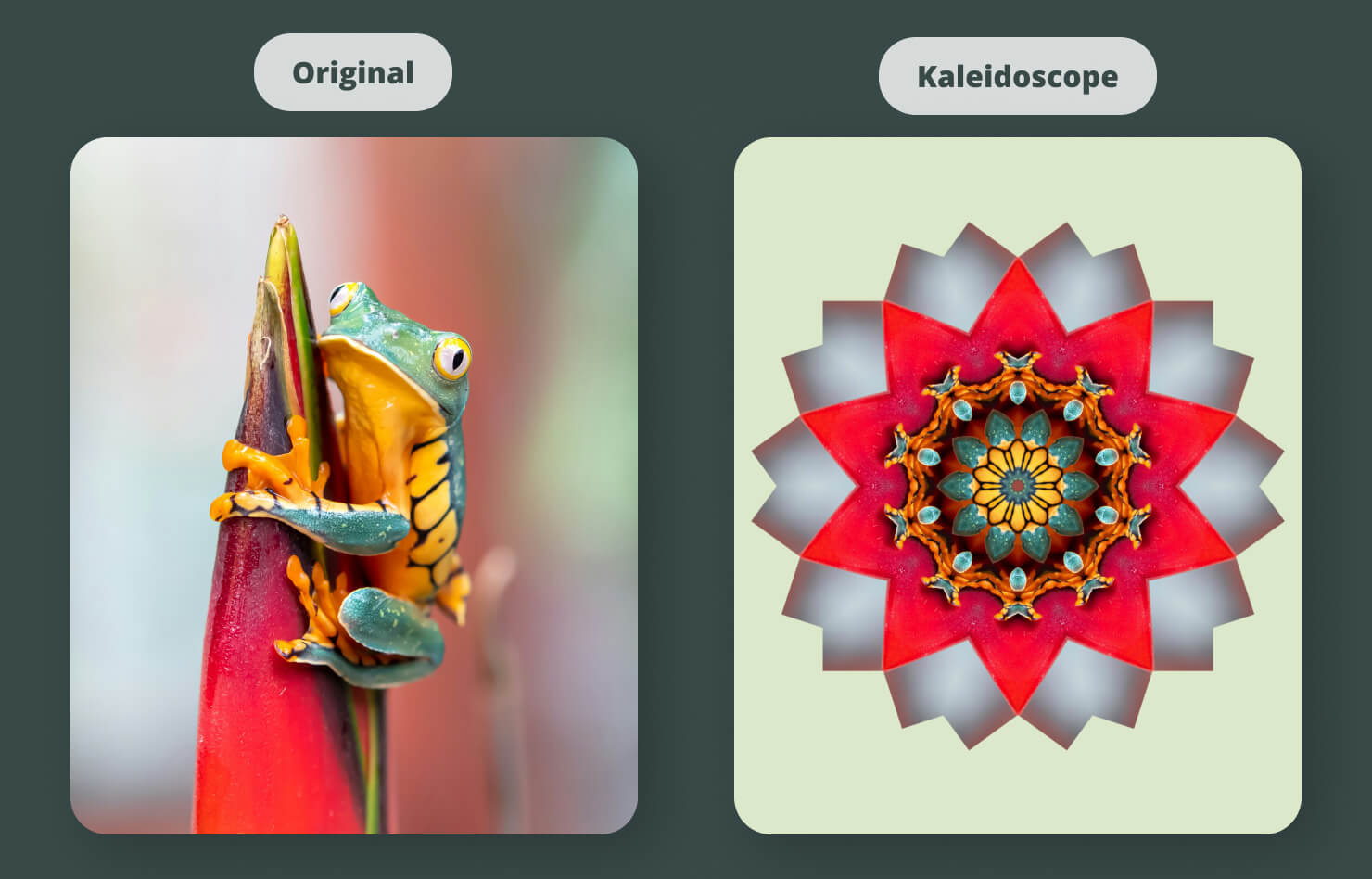
Don’t go hunting for a background pattern online when you can make your own. The Tile section takes a piece of your image and repeats it in complex ways. Kaleidoscope is the star here—it turns even a boring photo of a leaf into a complex, symmetrical work of art. Use Tiled Textures or Reflected Textures to create seamless backgrounds for your multi-page booklets.
The Lumine Section: Painting With Light
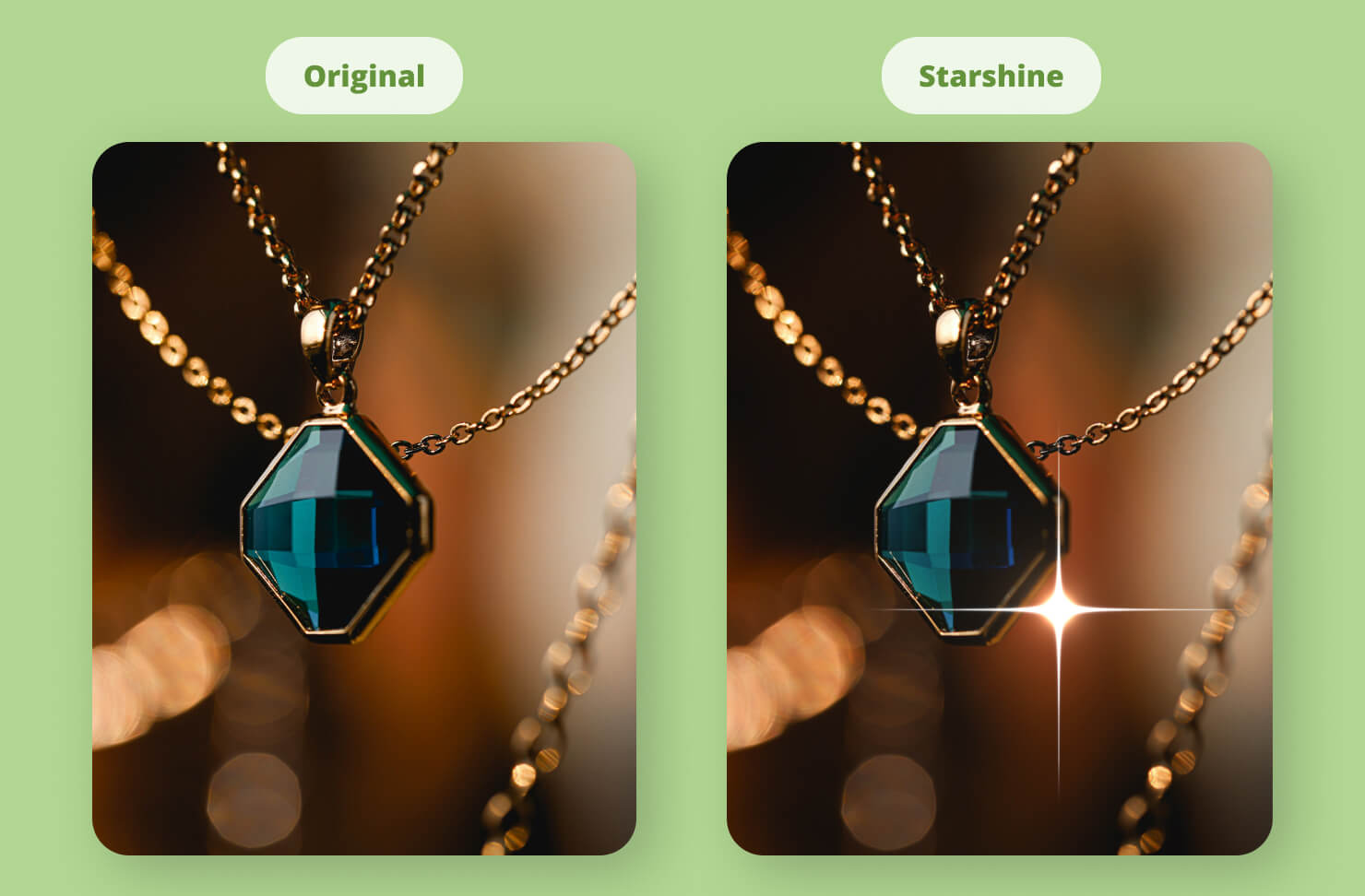
This section recreates light effects. You can use Starshine Generator to add a glint to jewelry or a twinkle to a night sky. Sunbeams allow you to place a digital light source behind an object, creating dramatic god-rays that add a sense of awe to your layout.
The Overlap Section: Transitions and Generators
Finally, we have the Overlap tools. While some of these, like Mod Transition and Bars Swipe, are often used for digital displays, they can be used in static design to create interesting split effects. Checkerboard Generator and Stripes are exactly what they sound like—quick ways to create geometric backgrounds without having to draw every line manually.
Conclusion
Core Image filters in Swift Publisher are a creative superpower. They allow you to move beyond simple layout work and into the realm of true visual artistry. The key is to remember that less is often more. You don’t need to use a Vortex Distortion and a CMYK Halftone on every page. Instead, use these filters to solve specific problems: use a blur to make text readable, use a sharpen to make a photo crisp, and use the Color section to make your branding consistent.
By mastering these sections, you turn Swift Publisher from a simple program into a professional design studio.
Frequently Asked Questions (FAQs)
Do Core Image filters damage my original photos?
The image editing capabilities of Swift Publisher rely on Apple Core Image technology, which uses a non-destructive pipeline where filters are applied as reversible instructions while the original image data remains unchanged unless you explicitly export or overwrite it.
Can I stack multiple filters on one image?
In Swift Publisher you simply adjust your first filter until it looks perfect and then you must click the Apply button. Once that first effect is locked in you are free to go right back into the list to add your next one.
Why does my Mac slow down when I use a lot of filters?
These filters use your GPU (Graphics Processing Unit). While modern M-series Macs handle them with ease, using dozens of complex filters like Vortex on very high-resolution images can eventually tax your system resources.
Will these filters look different when printed on paper?
Sometimes. Brightness-based filters like Bloom or Sunbeams create luminous colors that look great on a screen but may appear slightly duller when printed with physical ink. Always do a test print if you are using heavy light effects.