Tips and Tricks for a Successful Design
Being a combination of ideas and visualization, design is a subject with endless possibilities. Therefore, the types of design selection may vary according to your needs. For instance, for a website, you will require a simplistic and UI/UX-friendly interface. On the other hand, an e-book design will be flashier and color-coated.
Although the design spectrum and strategy may change depending on the requirements, some tricks and tips are consistently common in all stellar and eye-catching designs. This article introduces some core tips that help designers polish their ideas and working patterns.
What Is a Successful Design in DTP?
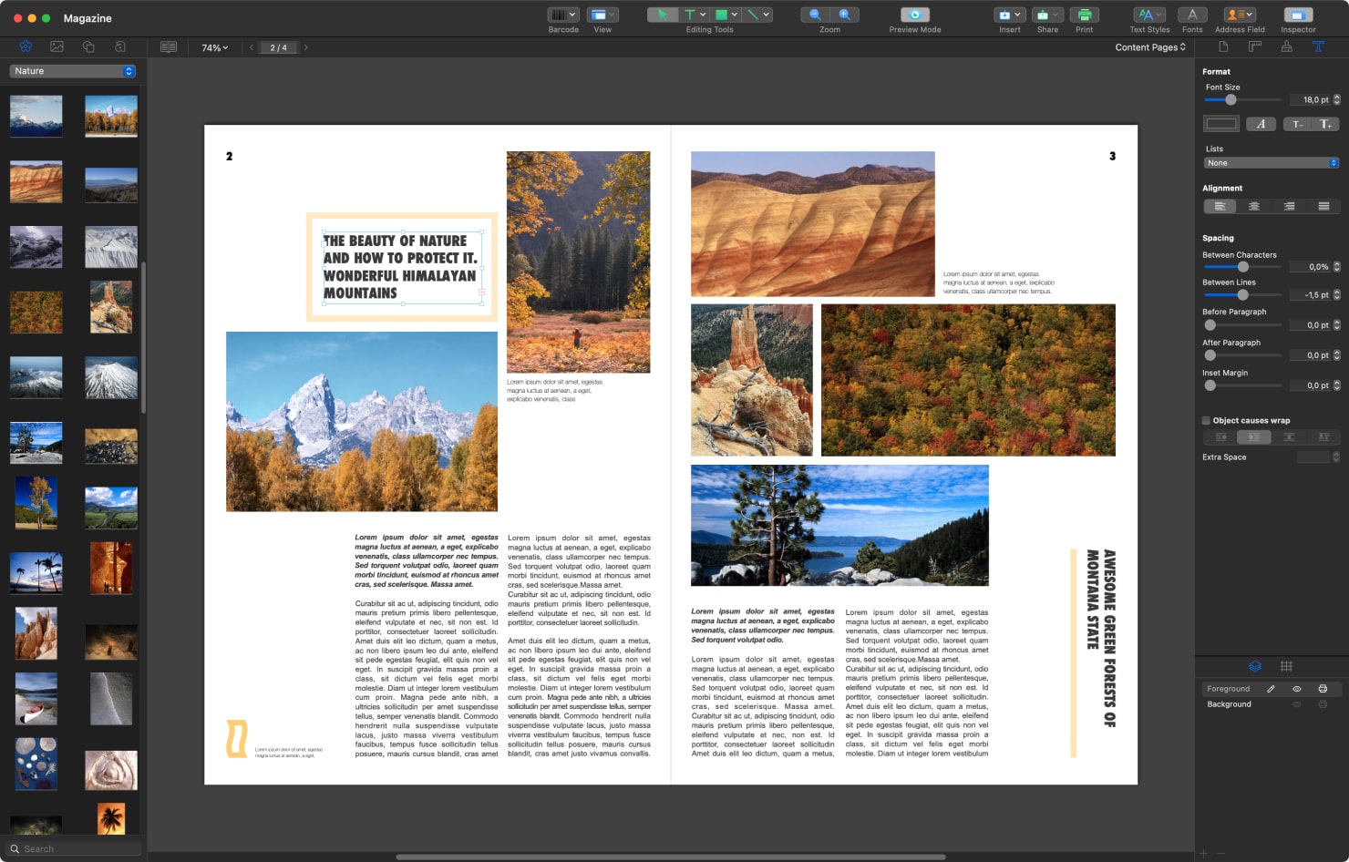
Desktop publishing (DTP) is the creation of documents using page layout software on a personal (desktop) computer. A successful design in DTP is simple, symmetrical, visually structured and easily understandable.
It comprises white space, visual alignment, typography coherence and a finely-tuned color scheme. A good designer can combine all these factors equally without overusing them. We recommend you explore the world of desktop publishing with Swift Publisher and create your design.
Practical Design Tips and Tricks
Being a creative designer means being accustomed to the fluctuating aspects of the design world. Apart from the changing dynamics, there are constant tips that have remained intact throughout. Designers must have a firm grip on the following tricks and tips for transforming ideas into reality.
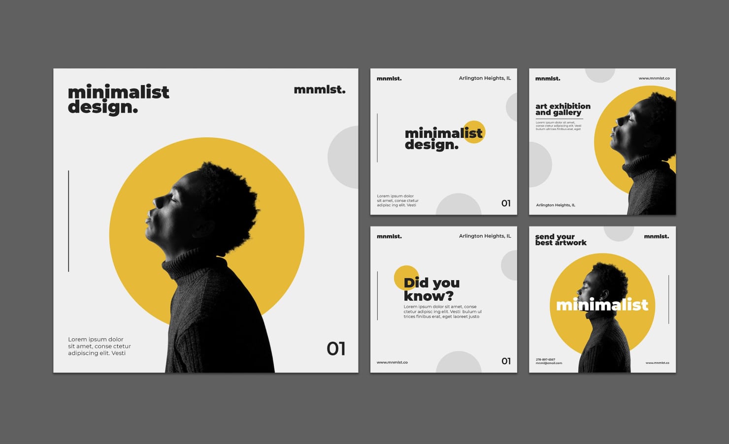
Simple Is Superb
Simple design is key to getting it done precisely. Precision is a UI/UX factor and is affected severely by flashy design elements. Some designers believe that a graphic designer should have a unique design perspective. However, making it complex will degrade the precision factor.
Therefore, you should stick to a simple graphic design to maintain balance. It is good to note that a multiplex design will improve the UI aspect but will downplay the UX factor. However, such a design strategy will not prove to be a beneficial and balancing addition.
Try to create a simple yet appealing design in terms of contrast, text, typography and structure. Take a simpler approach, and always remember that UI is a part of UX, not the other way around.

Give Due Importance to White Space
There are different opinions regarding white spaces in a design. Some neophytes consider white space to be a white background, which is incorrect. Instead, white space generally refers to the spacing between different elements.
Your layout will look cluttered and messy if there is less white space between the components. Therefore, a good designer will give due importance to the white space. White space—or negative space—will elevate the elegance of a project.
Moreover, a successful design accommodates all the components and content with the perfect use of white space, which amplifies its quality.
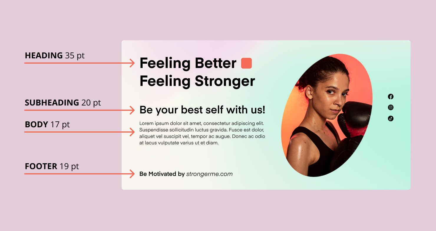
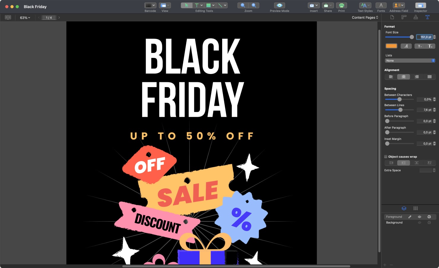
Type Hierarchy and Typography
One of the most crucial tips for a robust design is a type hierarchy. It is the font distribution method in which the designer uses different sizes and styles of fonts to highlight different portions based on their importance.
For example, the title of a document should have a bold and stylish font. In contrast, the underlying text should have a smaller and simpler font. This type of typographical management will ensure a design readability. When selecting your typography, you should keep it simple and easy-to-read.
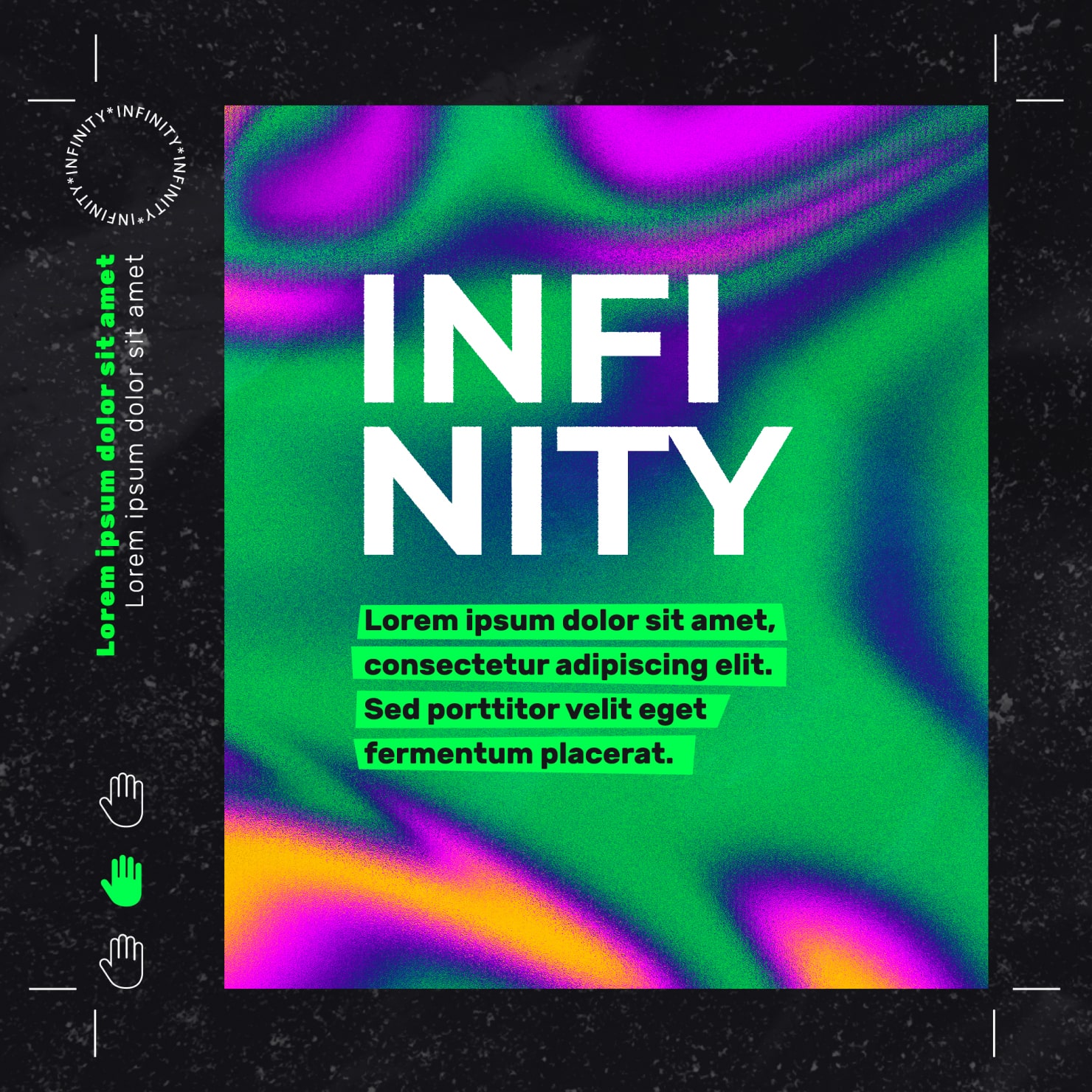
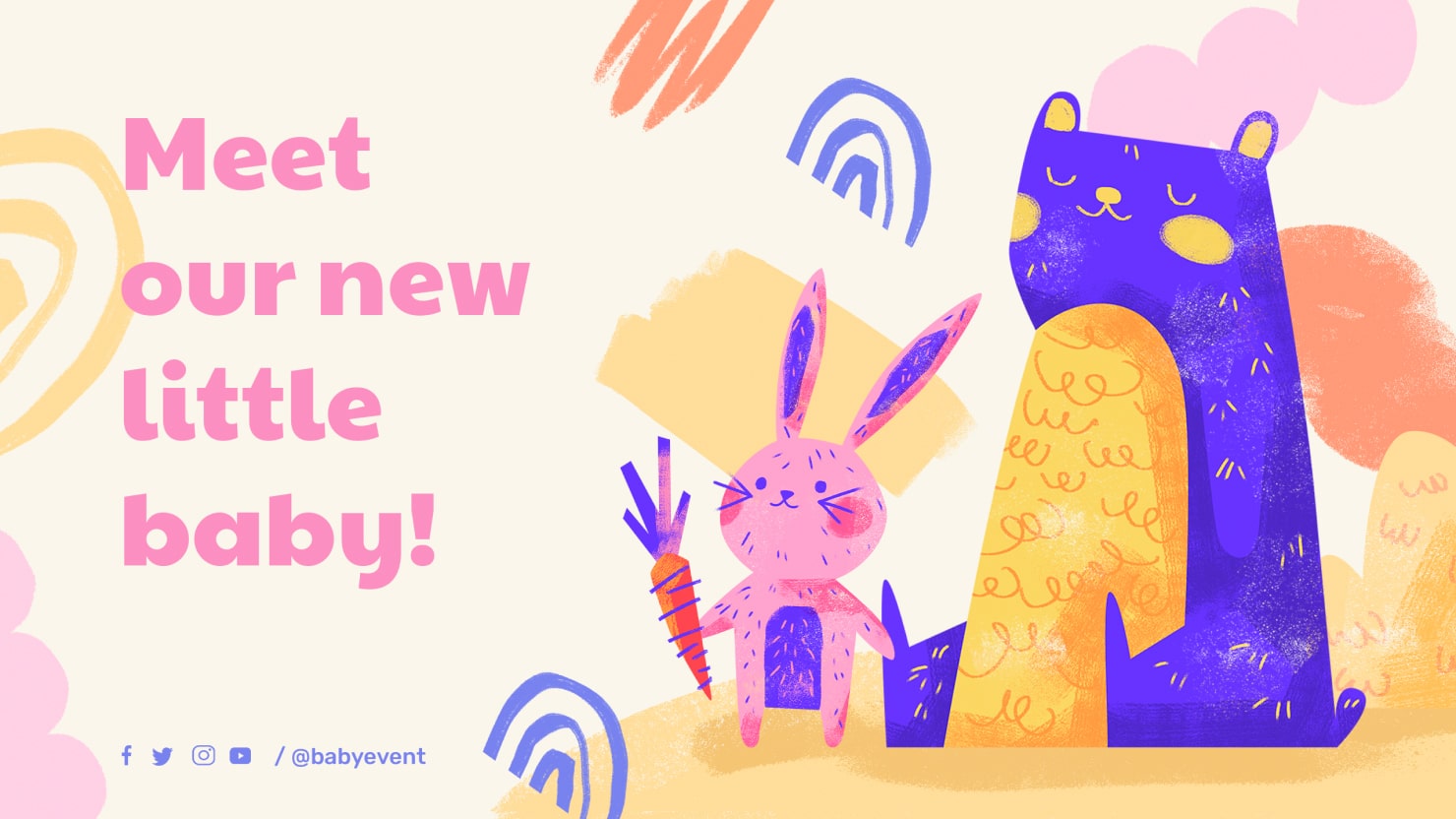
Create a Design With a Harmonic Color Palette
Colors are the visual and the first point of attraction in graphic design. They are the essence and the moving force behind the ideas. Unfortunately, a common mistake is overemphasizing color selection.
Sometimes, most designers end up stuffing the layout with a bunch of colors. It is a costly mistake as the projects will lose relevance in this cluttered color scheme. So, the best practice is to limit your design to a maximum of five colors. In this way, you can portray the visual message of the document precisely.
Readability—A Needle Tip Design Factor
In the flow of creativity, designers often forget about text readability. Yet, it is very important in giving a final touch to a successful document. Put yourself in the audience’s shoes and estimate the readability level a user will require.
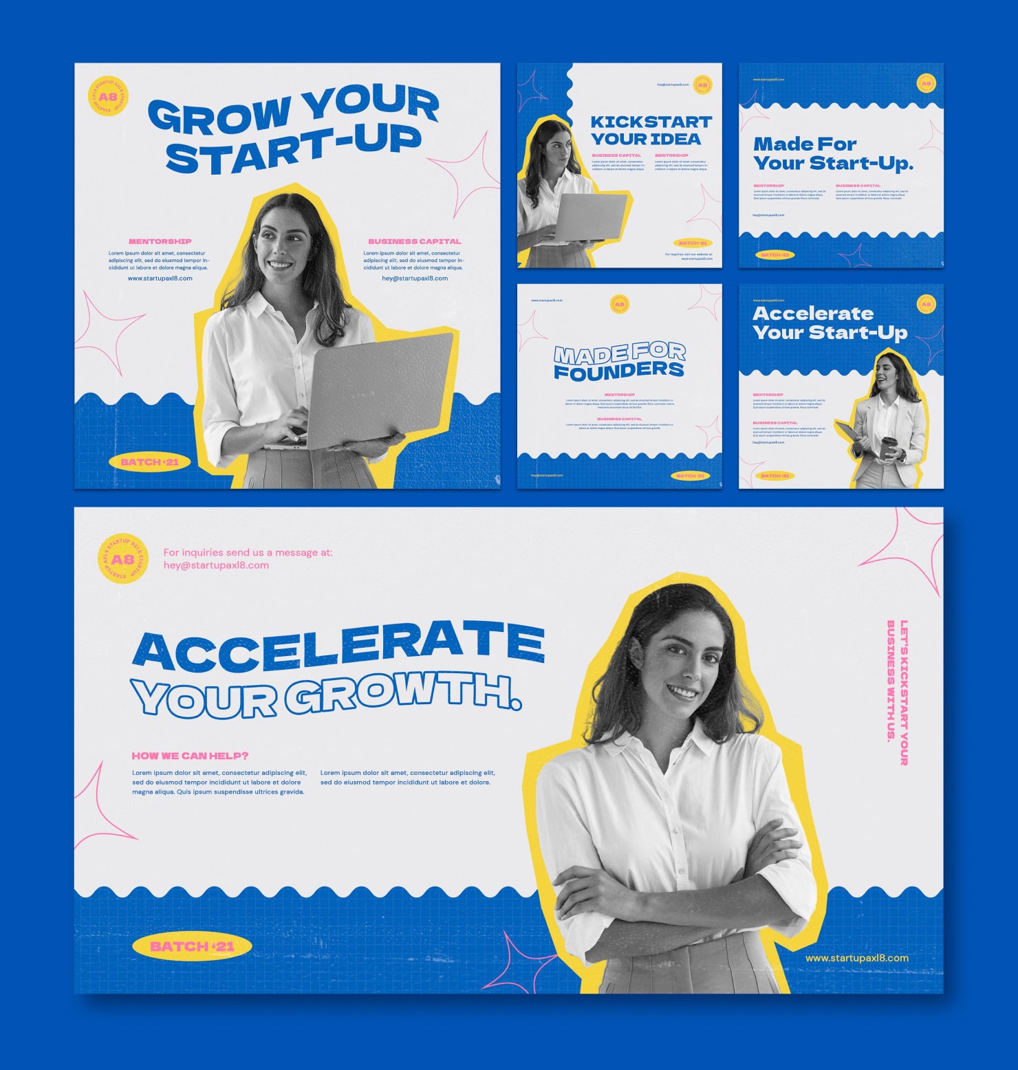
Consistency: A Unification Aspect
Consistency describes the structure of a document when every single element is in perfect harmony with one other. Consistency is vital for correlating different components of a unique and vibrant layout.
Additionally, enhancing the document consistency will make it more readable. Finally, you should connect the elements in such a way that describes the core theme in a flowchart pattern.
To Sum Up
Design is a continuously-shifting endeavor, with new tips and tricks introduced regularly. However, the basic tips are constant and form the cornerstone for creating a good composition. A successful design will include all the important aspects mentioned above.