Minimalist Graphic Design Principles
If you are a fan of simplicity but want to avoid boring layouts, it is high time you learn about minimalist graphic design. Minimalism is one of the continuing trends in the market that allows viewers to stay focused on the most crucial design elements and use their entire potential in a brilliant manner.

Whatever project you have, minimalist graphics will come in handy. This classic never dies, and, with the help of the right software like Swift Publisher, you can achieve brilliant results without difficulty.
Minimalism, as a part of the architectural tool, was first introduced back in the 1920s. Since then, it has become a leading power in other markets, including graphics design, among amateurs and pundits. Flyers, booklets, illustrations and much more—the art of minimalism can be applied everywhere.
Desktop Publishing Nowadays
Many people think that, with overwhelming digitalization, desktop publishing is dying. Definitely, during the last ten years, many popular print magazines ceased to exist. People no longer collect booklets with tentative discount offers.
However, it hasn’t disappeared, it just changed its form: from print to online. You search for everything on the internet now, and brands search for you there, too. Magazines, newsletters, booklets, ads are all online these days. And even restaurant menus are available online via a QR code on a table.
The content of the produced materials has changed as well: messy consumerism-obsessed designs of the ‘90s and 2000s have been largely replaced by concise and neat minimalistic style.

Minimalist Graphic Design
Less is more—this is an iconic rule of minimalist designs. To get a final result that matches all the ideas and requirements, you have to take into account the following considerations:
- Work on your visual and informational content. It is critical to choose the right amount of information to show on the document or website. Text brevity and a duo of bright colorful accents will be considered minimalistic with the hue as the leading focal point.
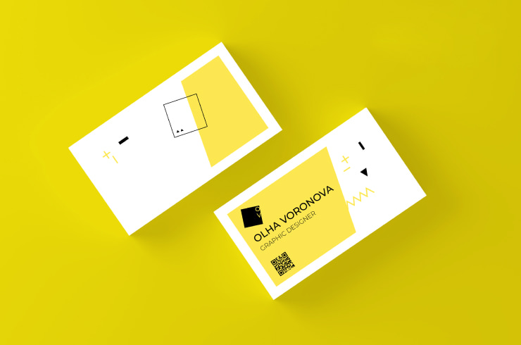
- The necessity to avoid an overcrowded effect makes enthusiasts apply signs, symbols, QR сodes and patterns that will be largely understandable.
- Minimalism and gobbledygook are your enemies. You have to literally throw away as much as possible and get straight to the point: every word, image and symbol must have a clear meaning and work together to help you convey your primary message.
Five Key Minimalist Graphic Design Principles
The main goal of minimalist creations is to do more with less and create smarter and more functional designs. Applying the fundamentals of the minimalistic style is not hard and will drastically evolve your design skills. Take into account what principles are best to implement in your working strategy.
Simplicity
Minimalism and simplicity are frequently confused, but they are not the same. Simplicity should be accepted as a basic minimalism principle rather than its one and only fundamental. Simplicity lies in using as few design elements as possible and as simple shapes and typefaces as possible.

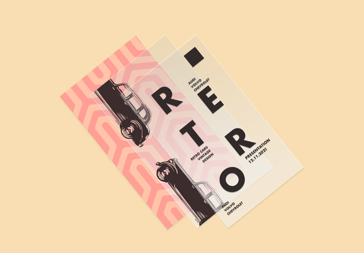
Hierarchy
This approach can be compared with management of any kind. You know the basics and are capable of performing your duties in a timely manner. Hierarchy-rich designs simplify navigation for users, making the general palette of images and texts clearer. Here are some crucial features of these layouts:
- It is a wonderful chance to create a large piece of art, in which the structure is subdivided into modules and represents huge volumes of data smoothly.
- This hierarchical approach complements logical and strategic thinking that lies behind the scenes. Your storytelling becomes richer and catches customers’ attention until the end when it has a certain construction and interactive bridge between different modules.

Negative Space
The most common negative spaces designers usually think of are white and black. However, enthusiasts are welcome to break the barriers of this misconception and be more creative in their styling opportunities. Aside from bright tones or multicomponent templates that are usually associated with eye-catching elements, there is negative space. In its basics, negative space is embraced in order to guide viewers’ attention to achieve the best reaction to your message or call to action.
What’s more, the fact that it provides visual relief shouldn’t be neglected. It is a great chance to analyze the offered information thoroughly.
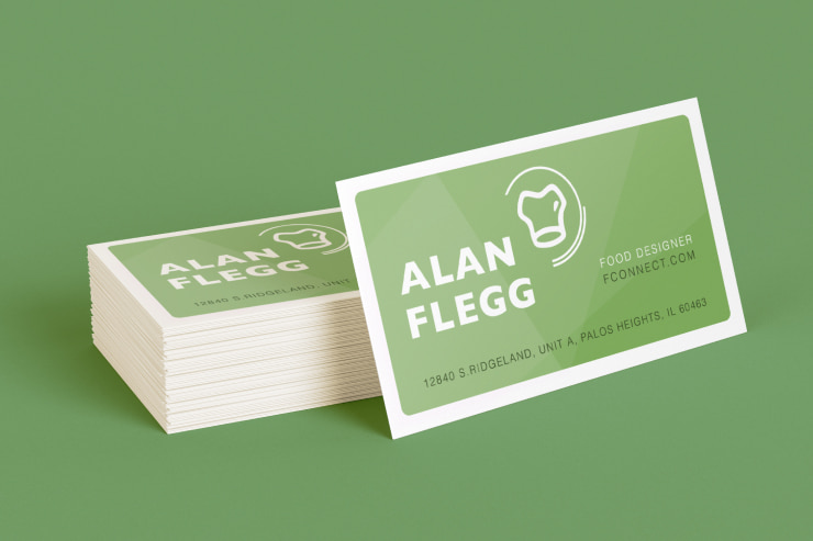
Neutral Colors
Neutral colors are also one the most distinctive elements of minimalist design. The list of such shades includes browns and tans, as well as gray, white and black. Although neutral colors can lead to a calming and soothing effect, that’s not the only characteristic they possess. They also don’t seize the viewer’s attention, allowing them to focus on the main elements of the design, which are often made in contrasting colors. Their benefit is gorgeous functionality as auxiliary and independent design elements. You can add more meaning to minimalist graphics by combining a neutral palette with other tones.
You can learn more about the psychology of each color by delving into the color theory. This craft involves multiple senses within one layout. Monochromatic backgrounds won’t be usable as complete minimalism designs—they are just a part of the canvas. In general, users apply three hues to define their accent notes, base and background itself.
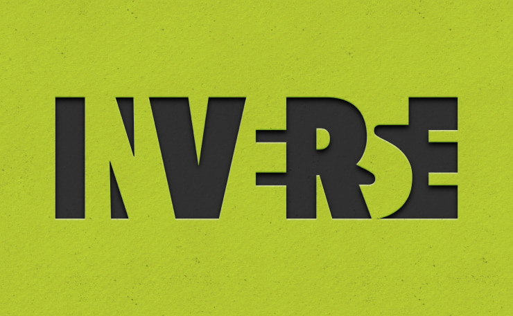
Readable Typefaces
It is a must to streamline typography, but you should be careful what font to pick up—they can easily enhance or break such a design. The most effective strategy for a minimalist design is to carefully consider readable and clean lettering styles. Taking into account that the design won’t include many elements, their visual material must be very clear.
Classic typefaces are subdivided into the following categories:
- serif
- script
- sans serif
- display
- monospaced
Choosing the right typeface is a science. Readability needs to go hand in hand with text legibility. Your mission is to analyze different fonts and exclude those that make letters or individual symbols hard to recognize. For instance, typefaces in which commas and dots are supremely alike won’t be an ideal choice for minimalistic designs.
When readability is sought after, it is a good idea to analyze eye movement opportunities and how visual patterns are perceived and recognized.
Easy-to-use Software for Minimalist Design
By becoming familiar with the key minimalist design principles, you will easily avoid typical beginners’ mistakes. Regardless of its visual simplicity, minimalist designs may not be easy to implement, but, with the help of the right software, excellent results are achievable.
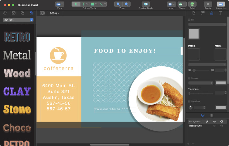
Swift Publisher is a great example of such software. The app is designed in an intuitive way, letting amateurs prepare layouts of different complexity levels from scratch, as well as by customizing included pre-designed templates of all types of DTP documents. High-end brochures, calendars, flyers and much more are all within your reach. For more details, you can start the trial on a Mac and see if the app fits your needs.