How to Design an Eye-Catching Album Cover
A beautiful album cover is the key design ingredient to add to your project. Thanks to well-designed visual representation, your musical performance will be easily noticed by people who have little understanding of your artistic path.
Think About Your Concept
As in the case of flyers or similar artwork, an album cover is a powerful tool to advertise your identity and make a noticeable statement about the services you want to promote. However, it is not as simple as it seems. Before coming up with any project ideas, enthusiasts must gather useful data and conduct research to style their covers in an eye-catching manner.
Music album cover design should not be limited to posting a great photo of your team. That is one method, but who says the design can’t be more appealing and inviting? The design process itself must include crucial pieces of knowledge about your team identity. You should know exactly who you are, your audience’s expectations and industry trends to consider and avoid:
- Find some inspiration. Whether you analyze pioneering designs or more modern versions, you will want to consider myriad record covers—from Nevermind by Nirvana to When We All Fall Asleep, Where Do We Go? by Billie Eilish. A simple search for the best and most popular album covers will ease the process of designing your own creation.
- Think about what emotions and feelings your new music will evoke. It is suggested to incorporate these hints as your guidelines in design.
- Don’t hesitate to choose a brainstorming strategy. Collect all the ideas that come to your mind, even those that seem unsuccessful at first. Don’t let stereotypes drive you in the wrong direction.
Find the Right Color Palette
Working with colors can be compared with preparing food— designers (and chefs) must incorporate delicious ingredients to retain their original quality. Be it watercolor effects or decent photos, a front cover that doesn’t reach the hearts and eyes of your target audience is useless:
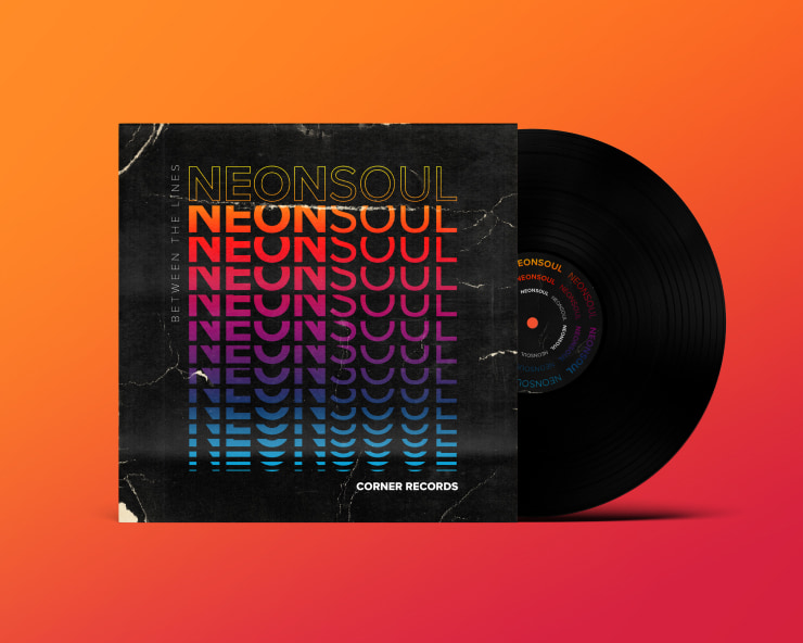
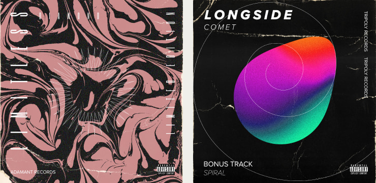
- Even stunning shots can be detrimental if the color scheme is overwhelming or too stark. Stick to one chosen theme: minimalism, monochromatic images, gradients, ombré, blurred elements, analogous warm or cold shades and more. Acquiring background knowledge about this field is critical.
- Think about color psychology. This study helps understand how even a quick glance at your cover can influence consumers’ decision-making. Analyze the emotional triggers of divergent tones and experiment with their combinations. For instance, green patterns will offer a more balanced view, while purple tones foster individuality and creativity.
- Don’t hesitate to use color wheels to define which tones work best together and what combinations are distracting and, therefore, poor in their attention-grabbing mission. Overall, customers are welcome to experiment with complementary, analogous and triadic colors.
Delivering Music Messages Through Visual Patterns
Without a doubt, it is critical to understand the benefits and uses of typography. In addition to determining how to send a strong message to your audience, it is very important to come up with an idea for the music cover content itself.
- The information you use on your cover has to coincide with the metadata precisely. This means that release details shouldn’t be different from what you are going to display on the artwork.
- Unlike other templates, this project doesn’t welcome the presence of brands, URLs, logos and similar references. If you hesitate about adding some text, you can simply leave your album cover without typography.
- Don’t make any notes about time. It is not wise to comment on new releases or exclusive songs right on your album cover. The same relates to pricing.
As is the case with color palettes, lettering and typography (if included), consider the following tips that have a psychological influence:
- Serif fonts evoke more traditional vibes and offer comforting feelings to viewers.
- On the contrary, modern letter styles guarantee a chic and progressive appearance.
- If you are looking for elegant styles, use scripts to decorate your album cover.
Important Dos and Don’ts to Create Album Covers
It should come as no surprise that music album design has its own peculiarities, which are especially crucial for beginners to know. The more aware you are of the unwritten rules of the industry, the more successfully your projects will reap their deserved victorious success. Here are some nuances to highlight:
- Album covers must comply with certain standard dimensions and qualities. To start with, JPEG formats are preferred in the majority of cases. At the same time, square-shaped projects are winning, the minimum size of which has to be 3000 × 3000 px.
- Determine whether your album cover content might potentially offend your audience by including inappropriate images and information. It doesn’t mean you can’t be risky and experiment with different styles, but some barriers are better left unbroken.
- It is unnecessary to bother yourself with choosing proper barcodes or alternative notes. On the one hand, this isn’t your duty. On the other hand, this information is likely to be altered multiple times, so eliminating it will save you time and energy.